


The rise of data science has transformed the world, and its impact can be experienced across almost every industry today. Marketing intelligence tools are no longer a discretionary spend, but a vital investment.
Wavemaker, the second-largest media agency network in the world, decided to foray into harnessing data science to drive media & marketing projects across their vast clientele. They have developed algorithms capable of running hundreds of thousands of econometric models on historical marketing data and current industry trends, to generate real-time, predictive models that can inform a brand’s future spending patterns. They were able to accomplish this with 90%+ accuracy. The algorithms even gave space for comparing your own product portfolio’s performance to category competitors.
Now, Wavemaker wanted to develop this computational capability into a Business Intelligence tool that could be offered to their clients. This would empower them to make more data-driven, intelligent marketing decisions on their media spends, through Artificial Intelligence and Machine Learning.
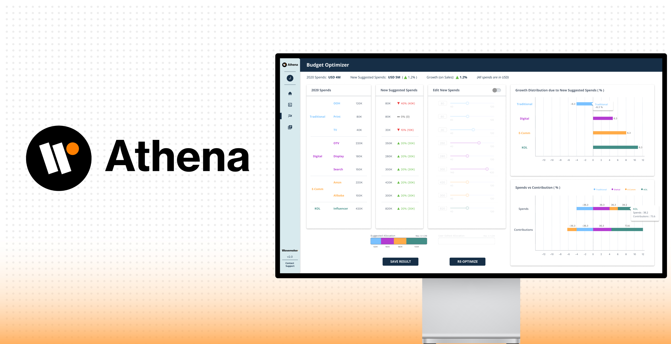
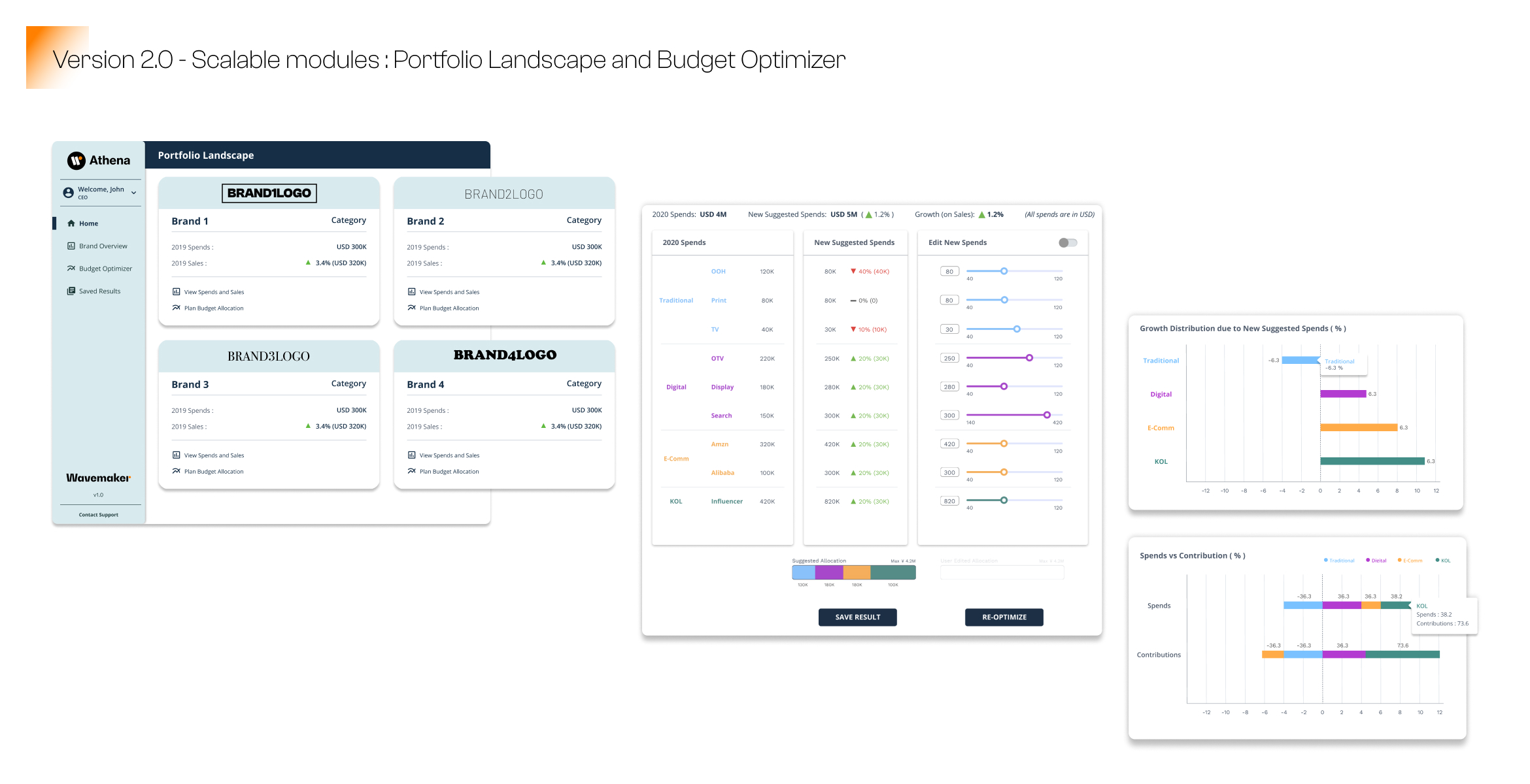
Enter, Athena – A first of its kind AI & ML driven intelligence platform, that holistically manages company portfolios, to maximize growth.
Athena was conceptualized as a scalable, boutique solution to cater to the diverse demands across markets, products and industries, when it comes to media and marketing intelligence. This served as our guiding light while developing the system architecture and product modules. The intention was to incorporate modular, dynamic components that could be tweaked easily as per specific market needs, while maintaining a consistently intuitive overarching User Experience.
We started with in-depth stakeholder workshops, to understand the basics from experts in data science, and uncover insights that would help us define the functionality offered across modules.


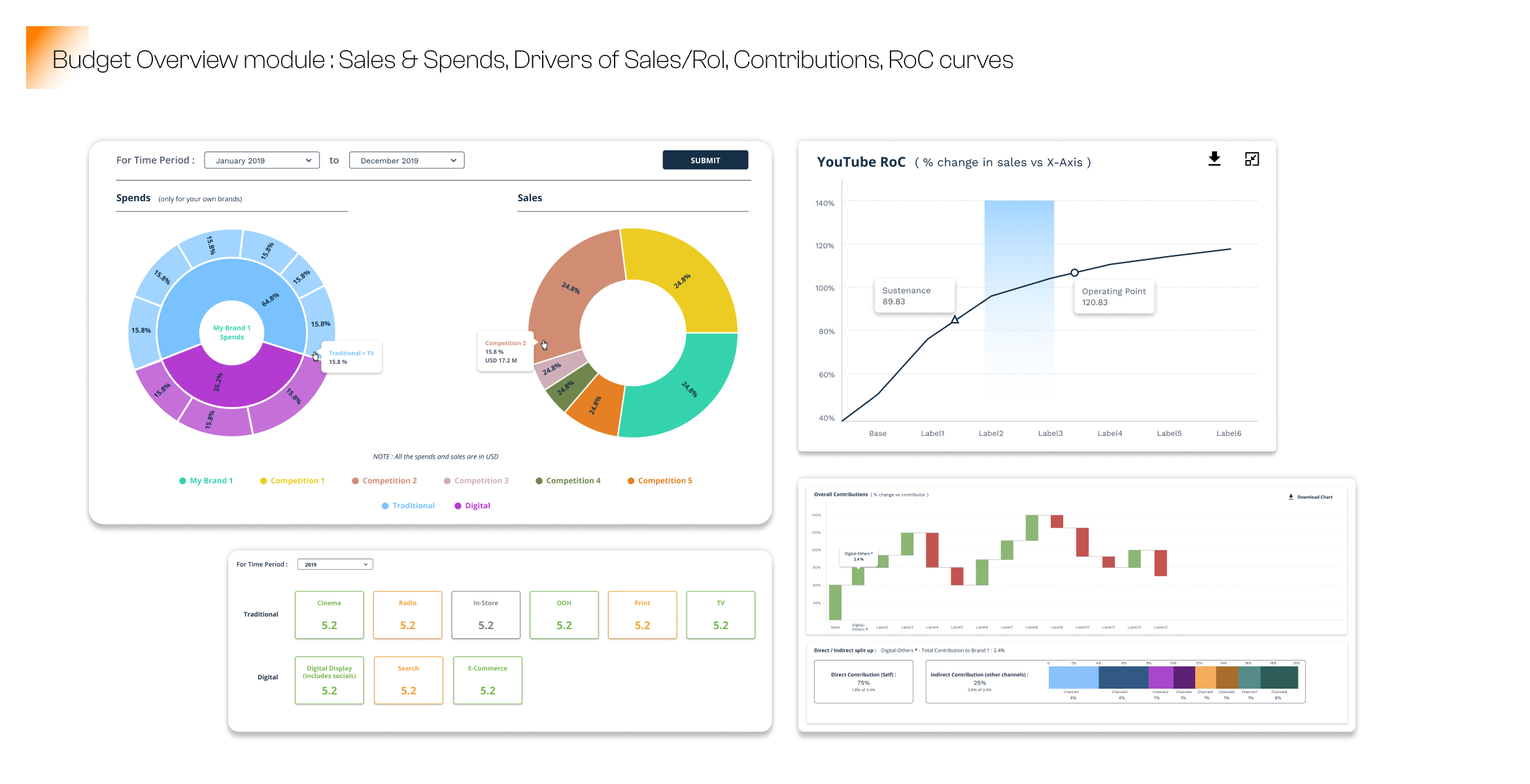
Balancing the complexity of data & information, with an intuitive, easy-to-grasp interface is key. It’s what makes or breaks marketing intelligence tools. The system is broadly divided into two main modules – the Brand Overview Module and the Budget Optimizer module. The Brand Overview Module gives the user a high-level glimpse of their historical data- spends as well as sales, and lets them compare it to their competitors’ performance. The Budget Optimizer module is where the interactive action happens, and the user can harness the power of the predictive models to obtain recommendations for future spending across channels.
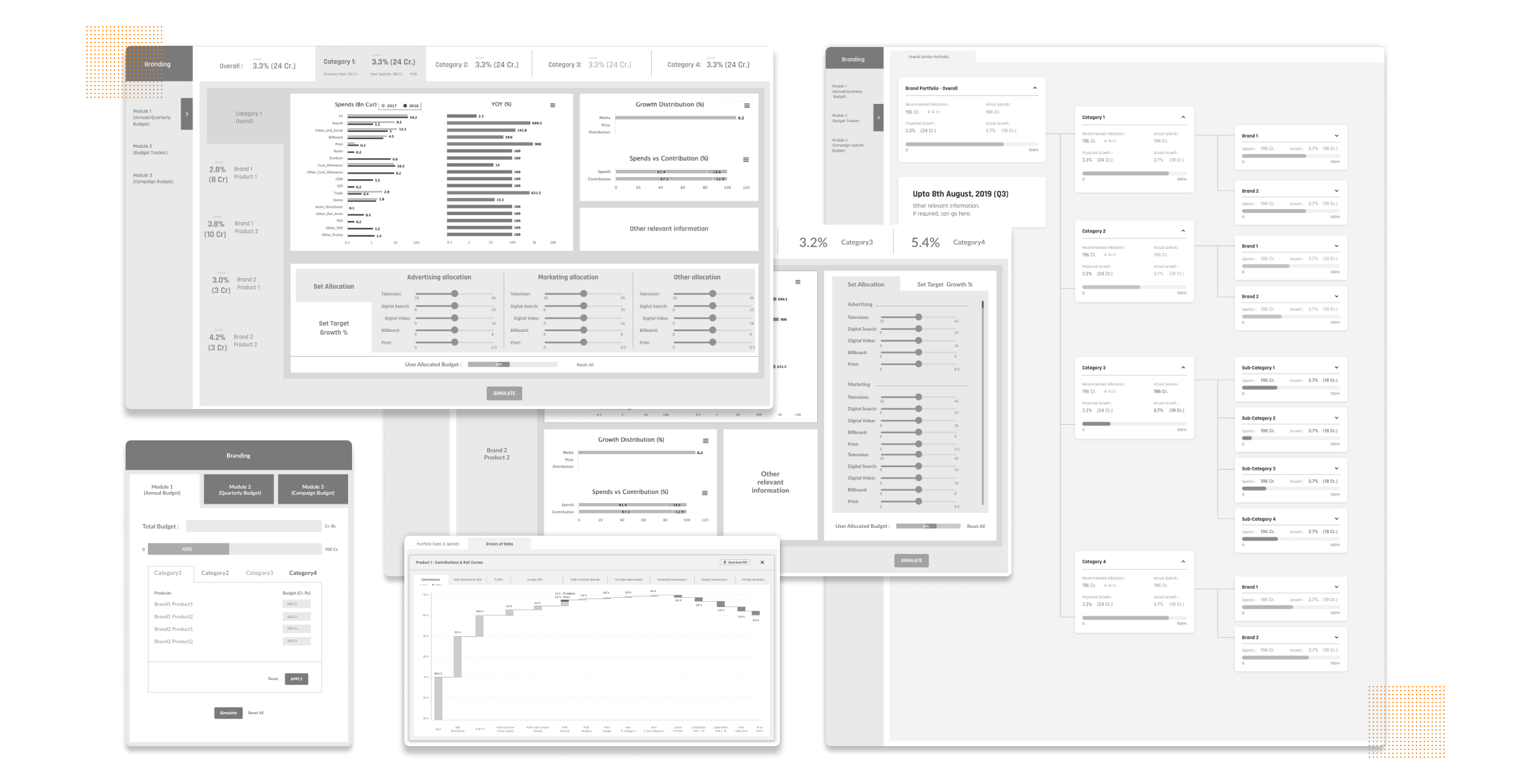
One of the key focus areas of the product is to be able to convey the important information to the user as a high-level view so that the user can see the correlation between various metrics that influence the media and marketing spends. Each metric was categorized and accordingly color-coded, to create a sense of familiarity in the user’s mental model; thereby making it easier for them to group chunks of data and form associations within the information, visually.
The channels are categorized as ‘Traditional’ and ‘Digital’, and each category consists of elements such as TV, Social Media, etc. The channels are differentiated by using different colors for easier recognition. There could be numerous sections under each channel category, depending upon the industry you belong to and your requirements.
We allow the user to view each channel’s contribution to impacting the brand’s portfolio, through graphical representations and analytical charts. The charts also depict halo and cannibalization effects, thereby indicating the indirect impact of one channel on another. Given the user’s portfolio and category condition, the charts communicate the channel category’s spends, and its potential contributions, in accordance with the same colour coding logic.

We designed this marketing intelligence system with a modular approach for increased scalability and seamless integration, to satisfy all the diverse user requirements and changes.
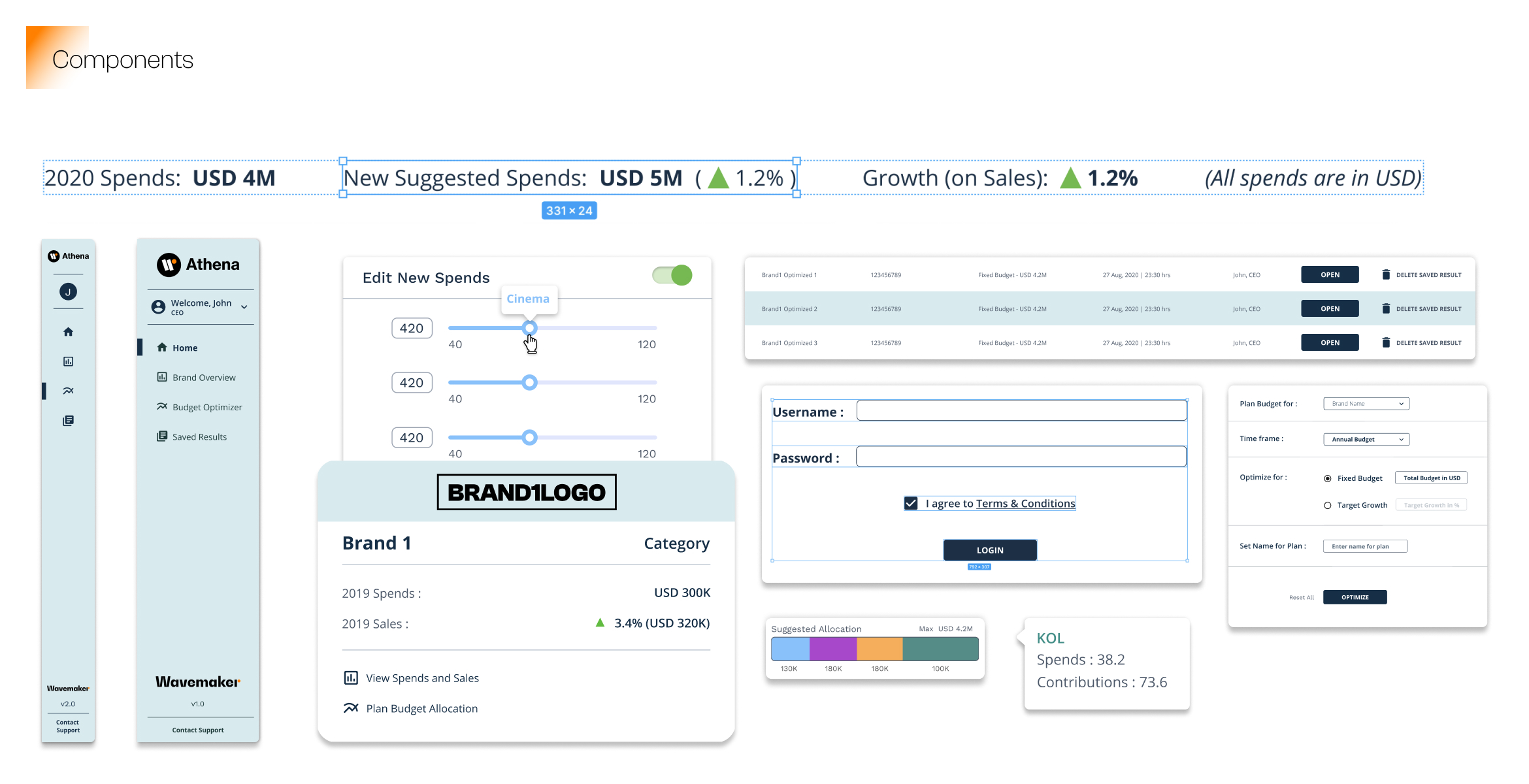
BI tools come with their own set of challenges from a user experience standpoint. They have to be able to display large chunks of densely packed data without causing confusion and mental burden. The system also requires dynamic views, so that the different levels of users that accessed it, would only see the information relevant to their domain. For example, a CMO should have access to the overall portfolio, in order to observe the halo and cannibalization effects that products or brands had on each other, and plan the spending accordingly. Whereas a brand manager or product category head would only need to see the products under their respective brand or category, to understand these intra-portfolio influences. To facilitate this, we decided to go with a modular UI that can be tweaked and scaled as per user requirements and can cater to multiple access levels.
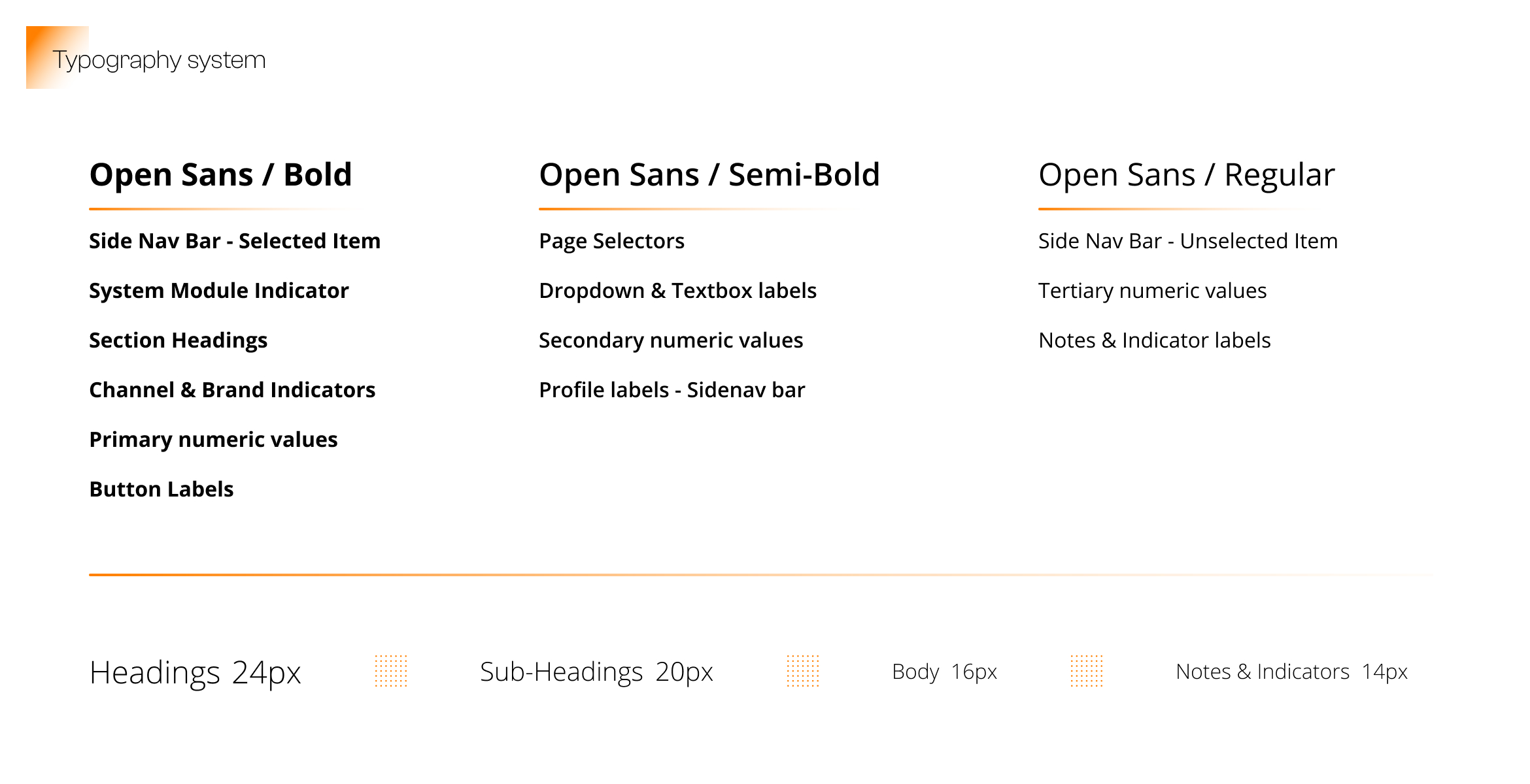
Once the architecture of the system is in place, with each module and its layout set, we turn towards the next layer of information: the Visual Design. This broadly includes design decisions of Typography, Iconography and Colour Palettes.
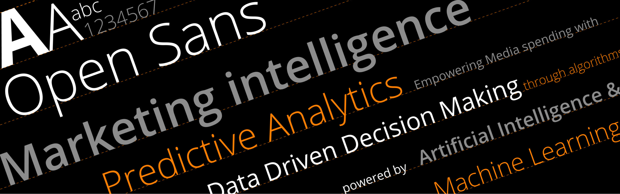
In this case, the colour palette was largely governed by the information to be conveyed at each user level in the UI, along with brand specific palettes. For the typography, we decided to go with Open Sans. It is an open source, humanist typeface optimized for print, web, and mobile interfaces, with excellent legibility characteristics in its letterforms. Once finalized, the type system was created as per the hierarchy of information to be conveyed, with its appropriate type weights and sizes.
For iconography, the motivation was to adopt a system that scales well, so that the turnaround time for modifications across versions can be reduced to a minimum. Keeping this in mind, we utilized Google’s Material Design Icon families, with its open source offering across different styles. The rest of the system’s components like input fields, buttons, labels, etc. were designed to align with the visual language of Material Iconography.
With the foundation in place, the next step in delivering a successful analytics platform is to plan its evolution. As design partners, we worked closely with the Wavemaker team to plan this phase. Review sprints were planned with the stakeholders, to understand and lay out the potential functionality requirements going ahead, and how that would shape the user experience of the product .
After identifying stakeholder expectations, it becomes crucial for us to balance those learnings with actual user feedback. In order to achieve that, we developed a User Testing plan which would help us gather insights into the product’s usability and the overall user experience.
With Athena, we helped Wavemaker to package their wealth of Data Science know-how into a SaaS platform that could be shipped to their various clients. With such a model, the power of Marketing Intelligence and Predictive Analytics could be brought to a wider audience of stakeholders and decision makers at companies, thereby enabling them to make better, data driven decisions in managing their media and advertising spends.