


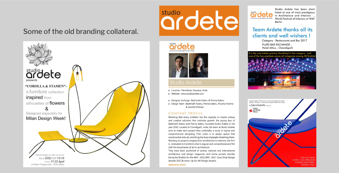
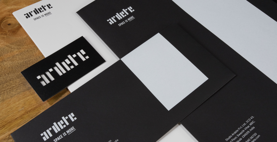
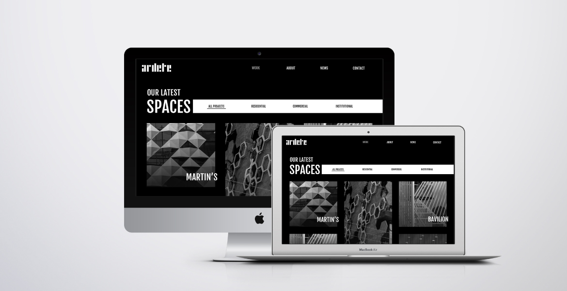
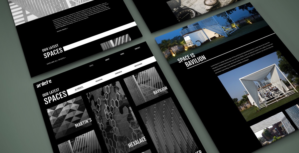
Studio Ardete is an architectural firm that boldly flirts with the boundaries of art and architecture. They take up every project with the view of erasing the divide between practicality and innovation. They needed an overarching identity that could be executed across communication touchpoints with high degree of flexibility and adaptation.
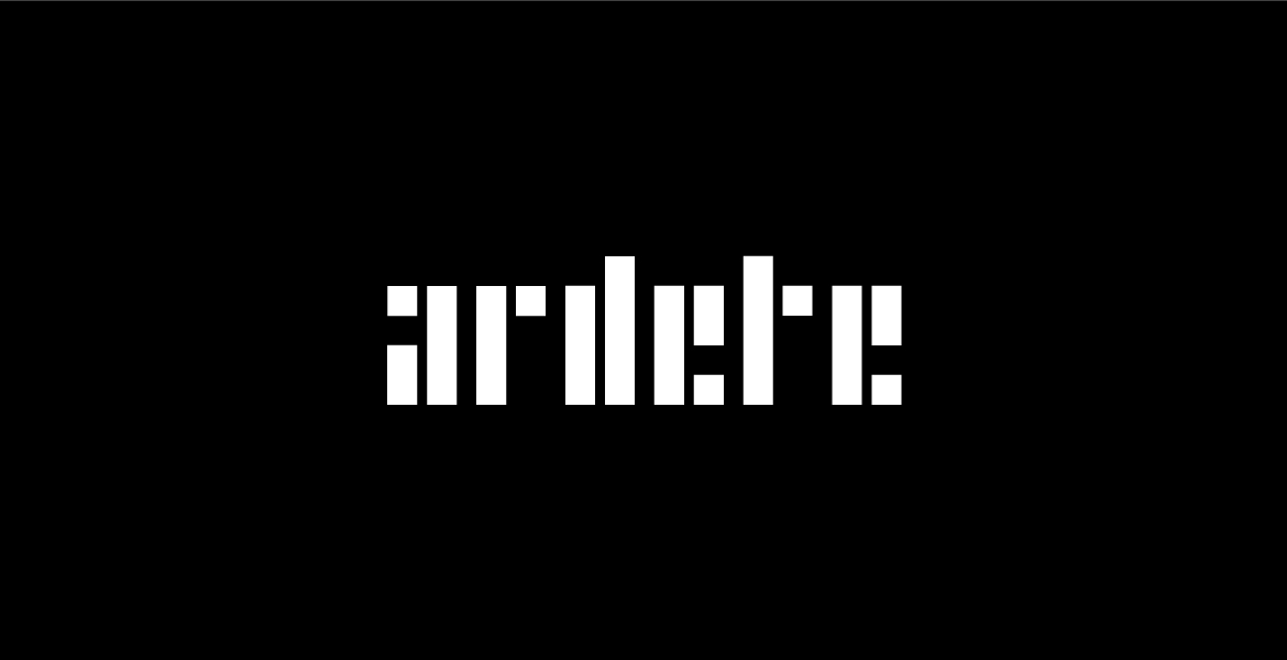
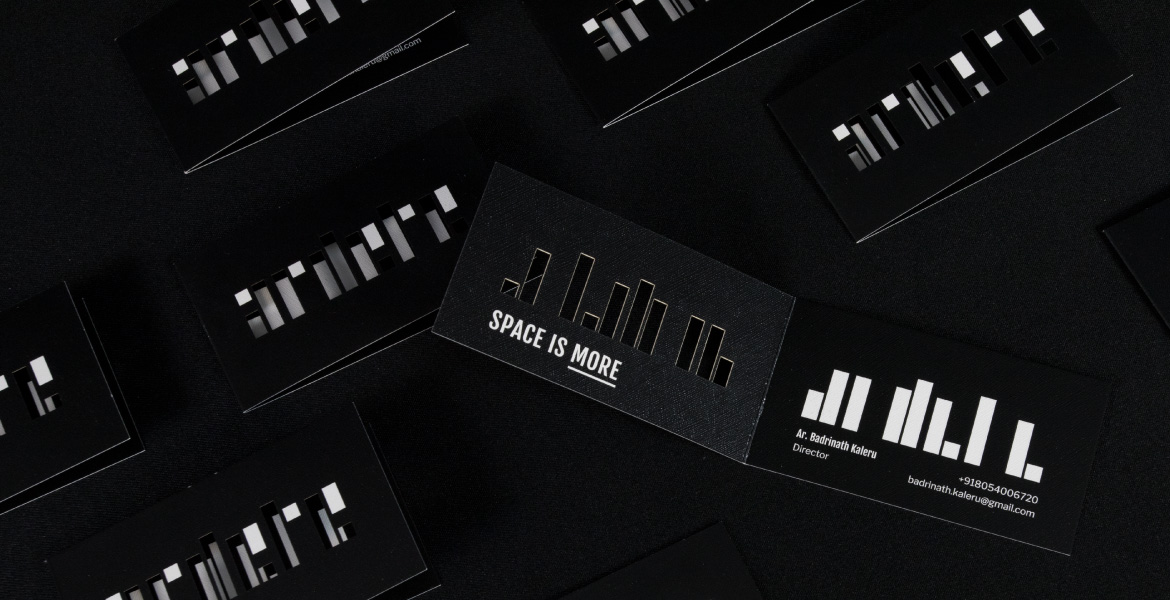
A critical aspect of the brand idea emerged from rethinking the form of the logo. The new stencil logo represented the progressive and constructive outlook of the firm. We creatively leveraged the block forms throughout their logo, website and physical marketing collateral to add an interactive element.
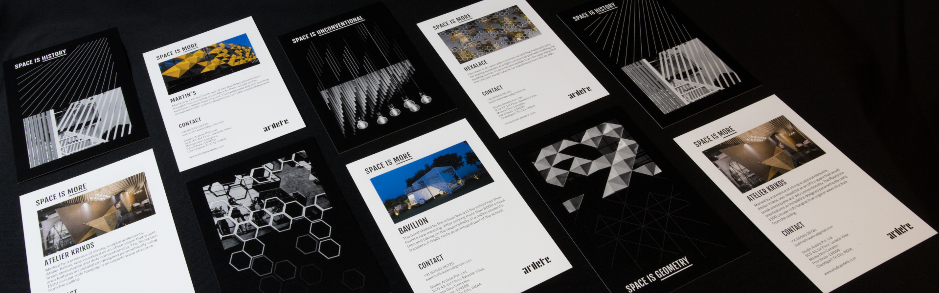
The tagline ‘Space is more’ was at the core of creating a visual vocabulary for the brand and giving it a powerful voice. It speaks of the multiple dimensions that inspire and influence space design.
The movement in the logo animation represents the synchronization of various elements that make a space. It reflects the natural rhythm of pulse or sound waves that move with balance.