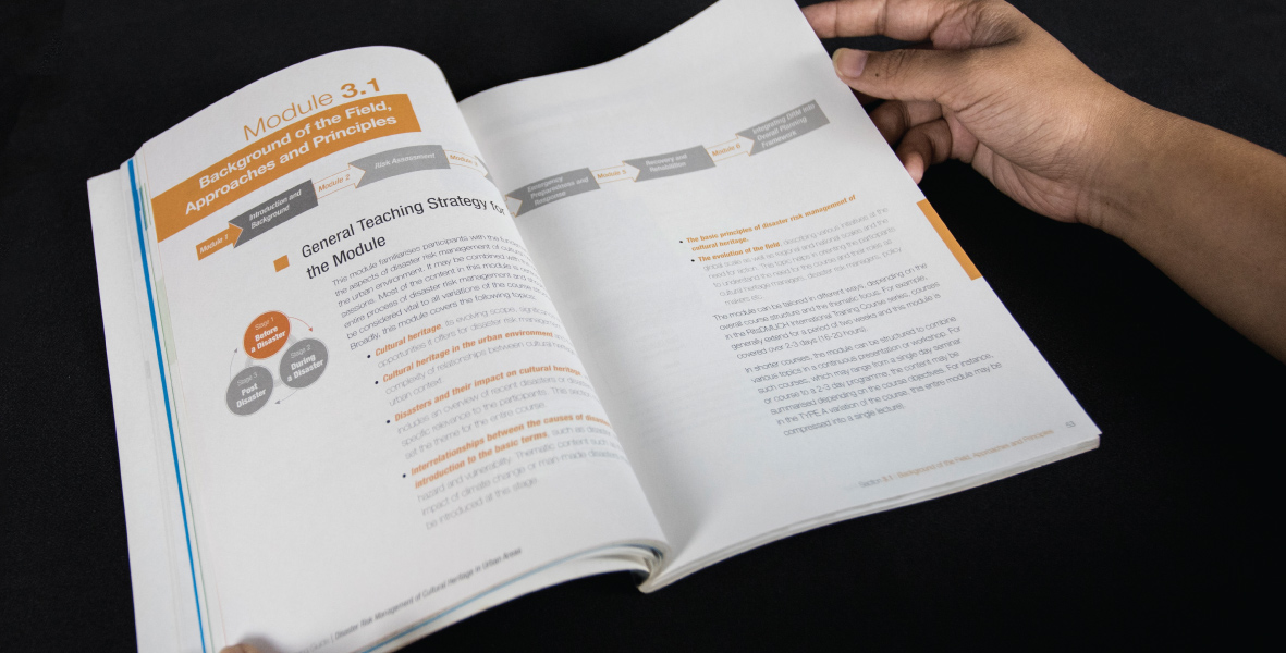
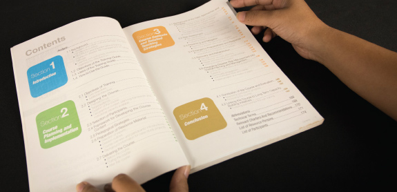
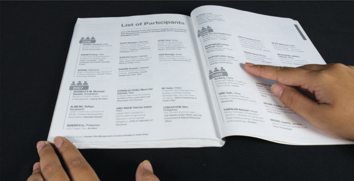
Most of the coursebooks you must have come across fall flat in spite of powerful content, majorly because of poor design. Publication design becomes all the more significant if the subject matter is heavy. Ironically, coursebooks are plagued with a dull visual representation of manuscript that discourages the young and the old alike from consuming information. To overcome this problem the Research Center for Disaster Mitigation of Urban Cultural Heritage, Ritsumeikan University, Kyoto collaborated with us for designing their training guide for the course that centred around Disaster Risk Management of Cultural Heritage in Urban Areas.
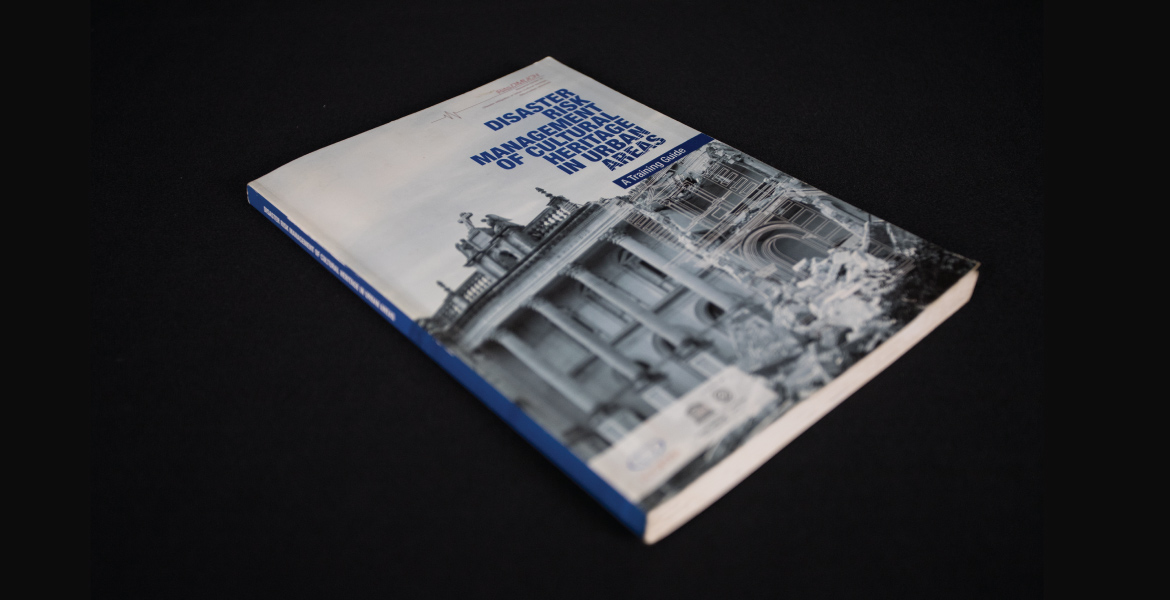
A good coursebook should very specifically cater to its target audience. The learning curve and design elements should align with the readers it has to educate. Hence the biggest challenge in designing this book was accommodating the preferences of the vast pool of readers. The book was meant for local residents (to raise awareness) to practicing professionals in the domain. To do justice to the content and readers we leveraged data visualisation and developed charts, infographics and diagrams straight from the crude content. As a result, the information of the book was easily digestible while its substance remained intact.
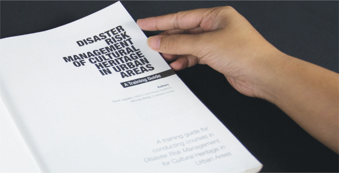
We relied on colour coding to panel the modules in the book in a bold and beautiful manner. The reader is constantly kept excited with photographs, uncomplicated infographics and/or highlight boxes at the turn of every page. All this is bound together with a layout that checks the consistency and typography that gives each chunk of text the breathing space that it needs.

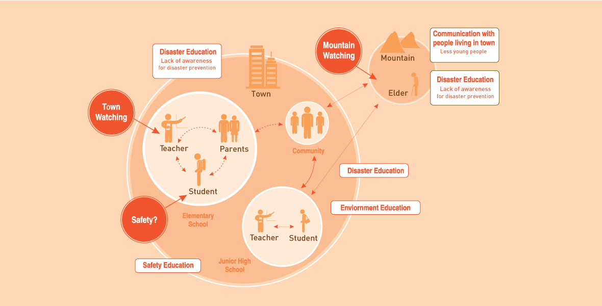

Our intent was to mold and refine the initial document into a notable book- one that is easy to navigate, provides an excellent study and stays on shelves for years. We often, unfortunately look at coursebooks as a labored medium of knowledge. This publication was a step we took in the direction of breaking that stereotype.
