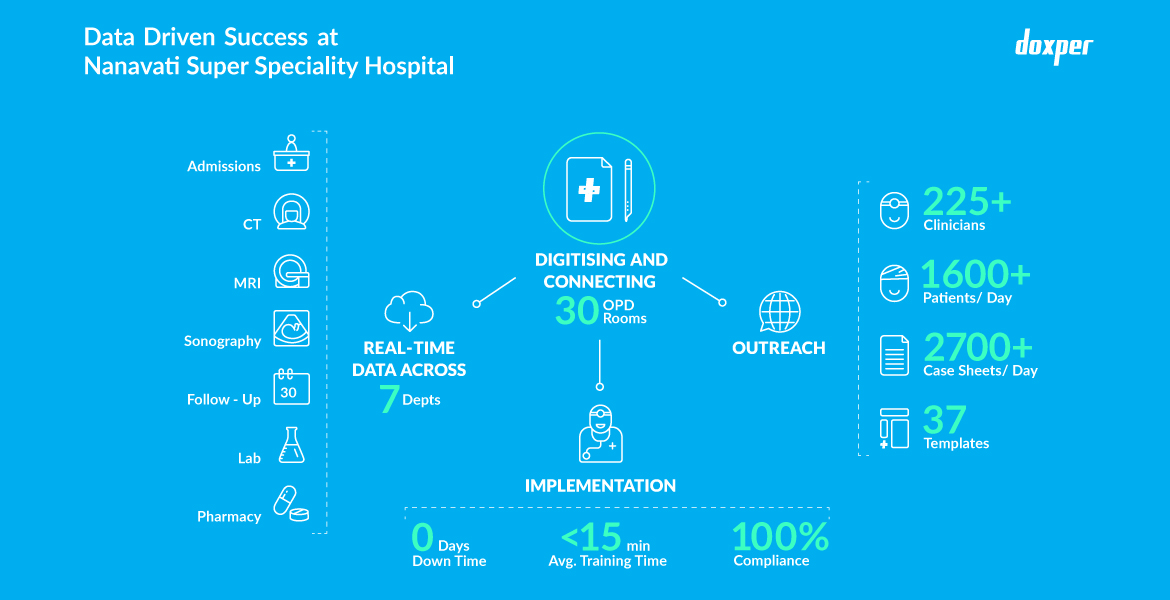
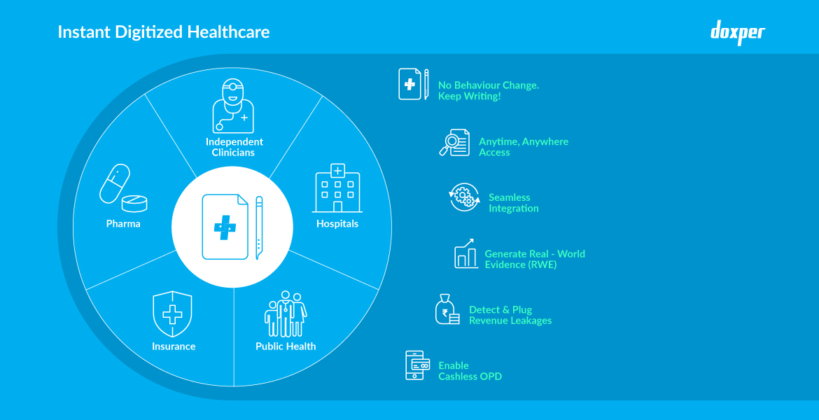
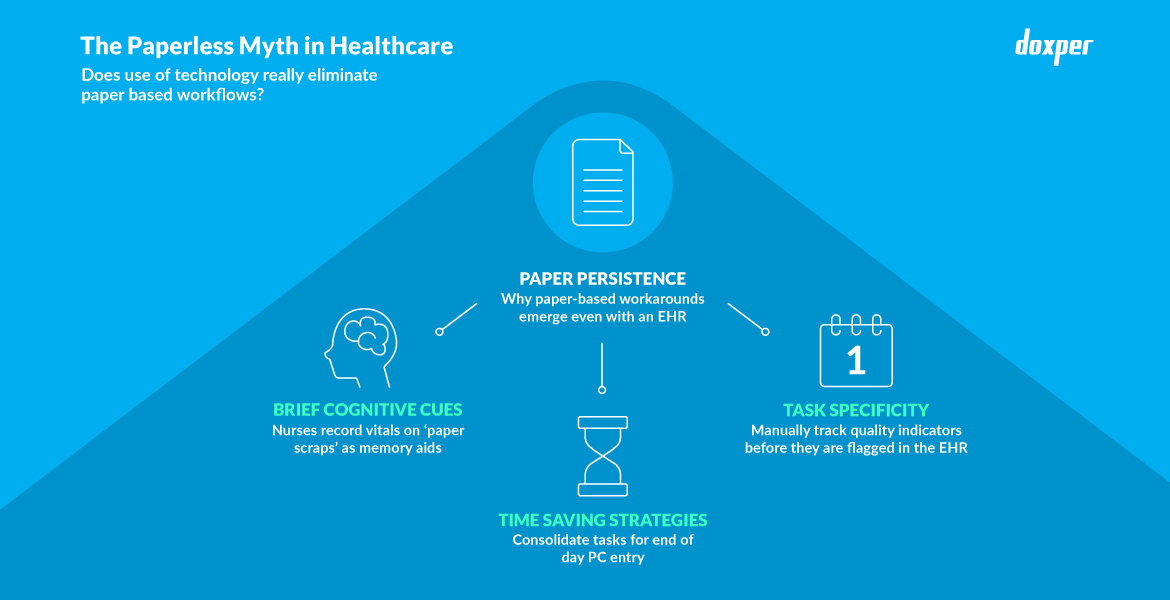
Doxper is breaking grounds in healthcare digitisation, letting doctors digitise their case sheets without changing their behaviour at all. This means that the tedious clicking, scrolling and typing that doctors have to go through to document patient records is taken care of, with a digital pen and coded paper that automatically records handwritten text in real time. All this data is securely stored on the cloud and seamlessly flows in the healthcare ecosystem. Doxper enables hospitals to be the well-rounded care providers they need to be, by ensuring that patients get the doctor’s undivided attention, they have complete access to their medical record and can seamlessly navigate the hospital’s services.

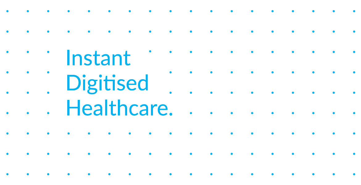
At the core of Doxper’s mission is mending the gaps in healthcare created by data silos. Their technology is gathering meaningful and actionable data that connects care settings to patients, patients to their own health information and all of them to decision-makers. Hence we visually translated this ‘connecting of dots’ into a pattern and a signature design element for the brand.
The element also represents the dot pattern used for AI mapping in the coded paper.

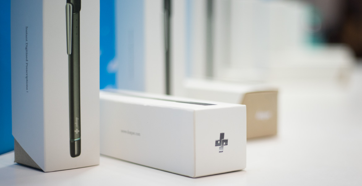
Doxper approached us for more than just a facelift. The company wanted to define who it was, what impact it was making in the real world and communicate it out and loud. Hence, a branding system had to be developed that did not just cater to the customers but all the stakeholders of the company for strengthening the sense of identity. The new identity for reinforced across all the touchpoints including their website, packaging, stationery and promotional material.


