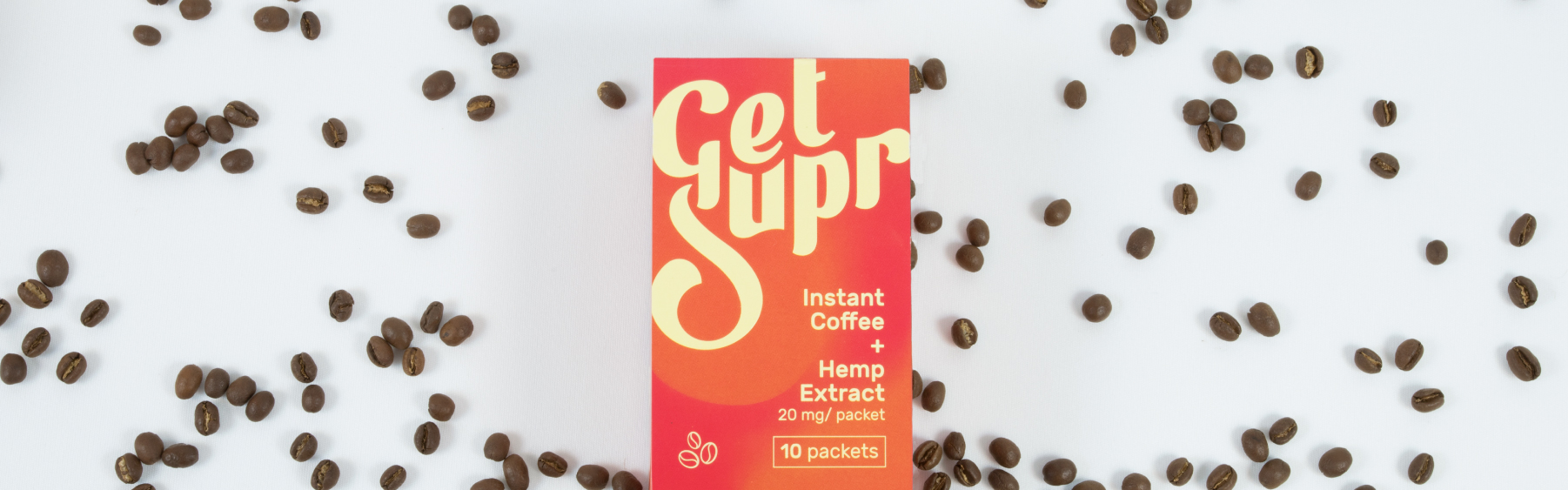
A novel project landed on our desk as an Indian design studio when Get Supr approached us for creating it’s complete brand system. Why novel? Well, Get Supr is an American brand selling CBD-infused instant coffee, an offering that is still alien to the Indian market. CBD or cannabidiol is a non-psychoactive ingredient derived from either hemp or marijuana plants that has a range of benefits from alleviating pain to easing symptoms of anxiety and depression. Right now, CBD products are amidst the boom of two popular consumer trends- a rise in the legal cannabis market place and the increasing demand for herbal lifestyle supplements.
And though the markets have flooded almost overnight with entry of brands offering CBD products from gummies to bath bombs, we realized that the design world is still in scuffles with an inherent visual personality of anything CBD. This has resulted in most of the brands being created in the safety net of a clean but medical identity.
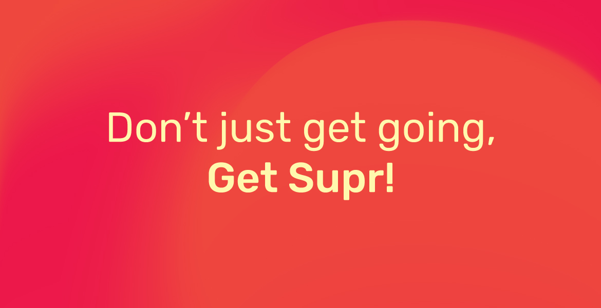
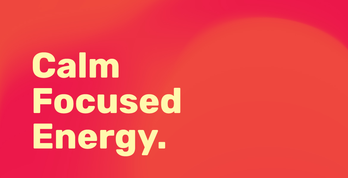
We created a playful visual identity for Get Supr- one that cuts through the existing market with its buoyancy and energy.

A major challenge while designing for a CBD brand is not creating anything in the image of the cannabis culture, because at the focus of the consumption of such products is that they deliver the health benefits of the plant without the high. You have to be careful about the possibility that as much as s reference of 420 can ward off customers from certain segments.
A tried and tested approach has been elegant and clean designs that position the product as a ‘safe bet’.
We decided to break away from the shackles of a sterile identity with a bold persona and clear messaging.
Narrowing down to the brand attributes, Get Supr is
Fearless because Get Supr is honest about it’s product and what it delivers and it says so with hard hitting and straight-cut language. No bulls#!t. The product is such that it challenges the status quo of the beverage industry and is eccentric enough to experiment till the best results are achieved. It’s steady- which is important because it gets you going on your feet as opposed to the drowse of the psychedelia induced by THC. CBD is different.
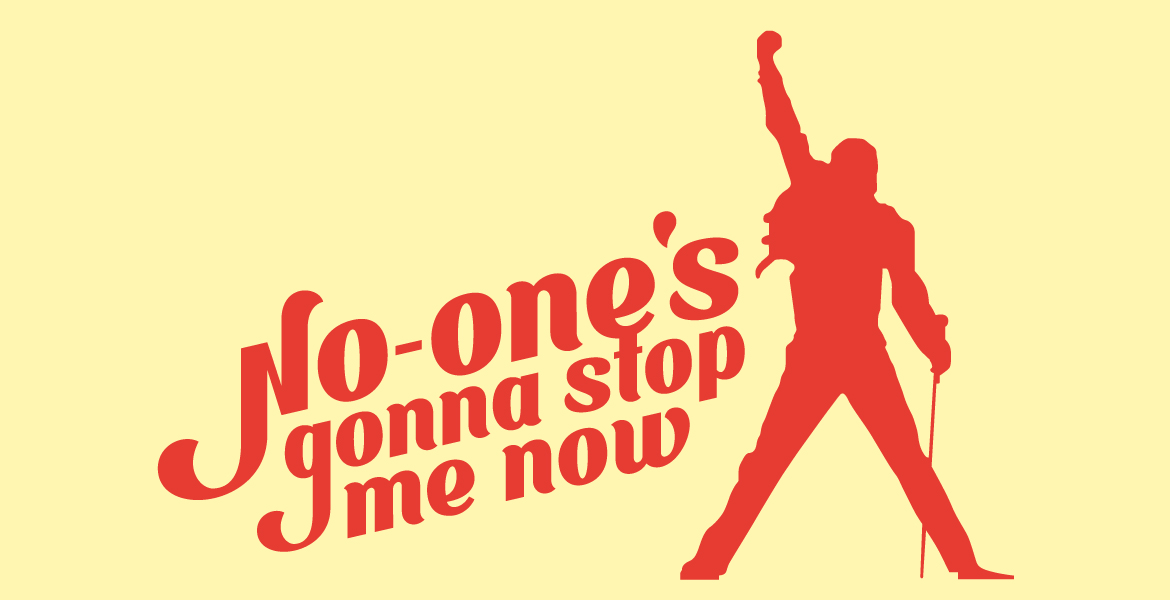
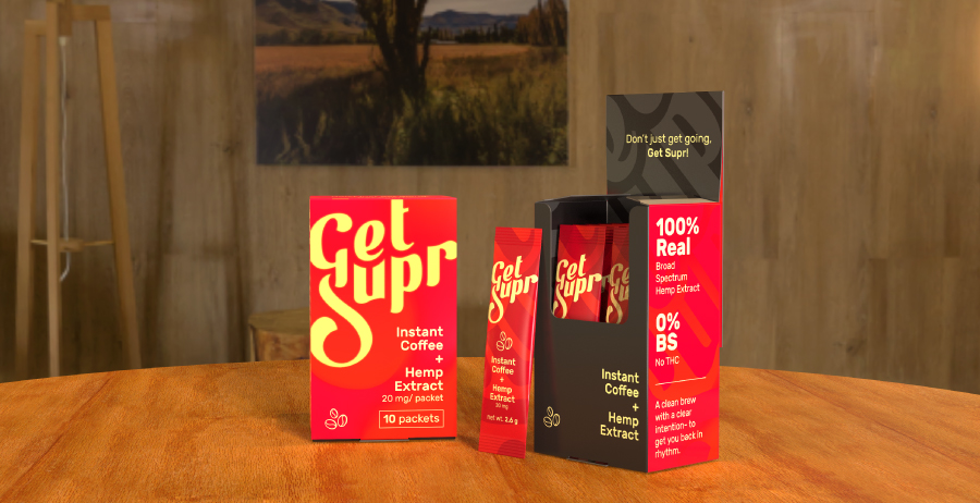
The visual language of Get Supr is inspired by the revival of the ‘90s. One strong inspiration for us had been the global pop culture around the time, in order to express the persona of the brand. The pop of the red, the curves of the logo font and groovy messaging.
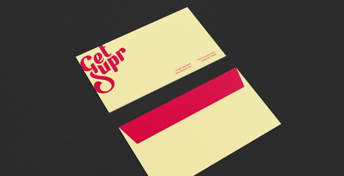
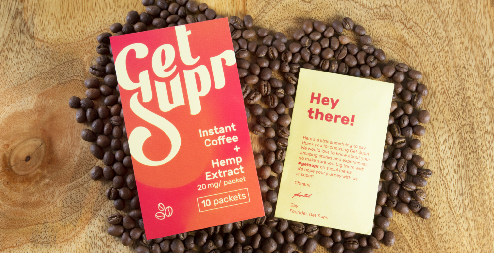
We strongly believe that packaging goes beyond just casing a product. The event of unpacking something is an entire experience. Here as designers, is our window to add value, deliver something more, express our gratitude to the customer.
The packaging of Get Supr is fabulously funky in ways. The message on the faces of the external packaging is interactive and it gets more so when you open up. A small thank you envelope sits in the front encasing complementary stickers of the iconic lyrics of tunes from the Rock ‘n’ roll era.