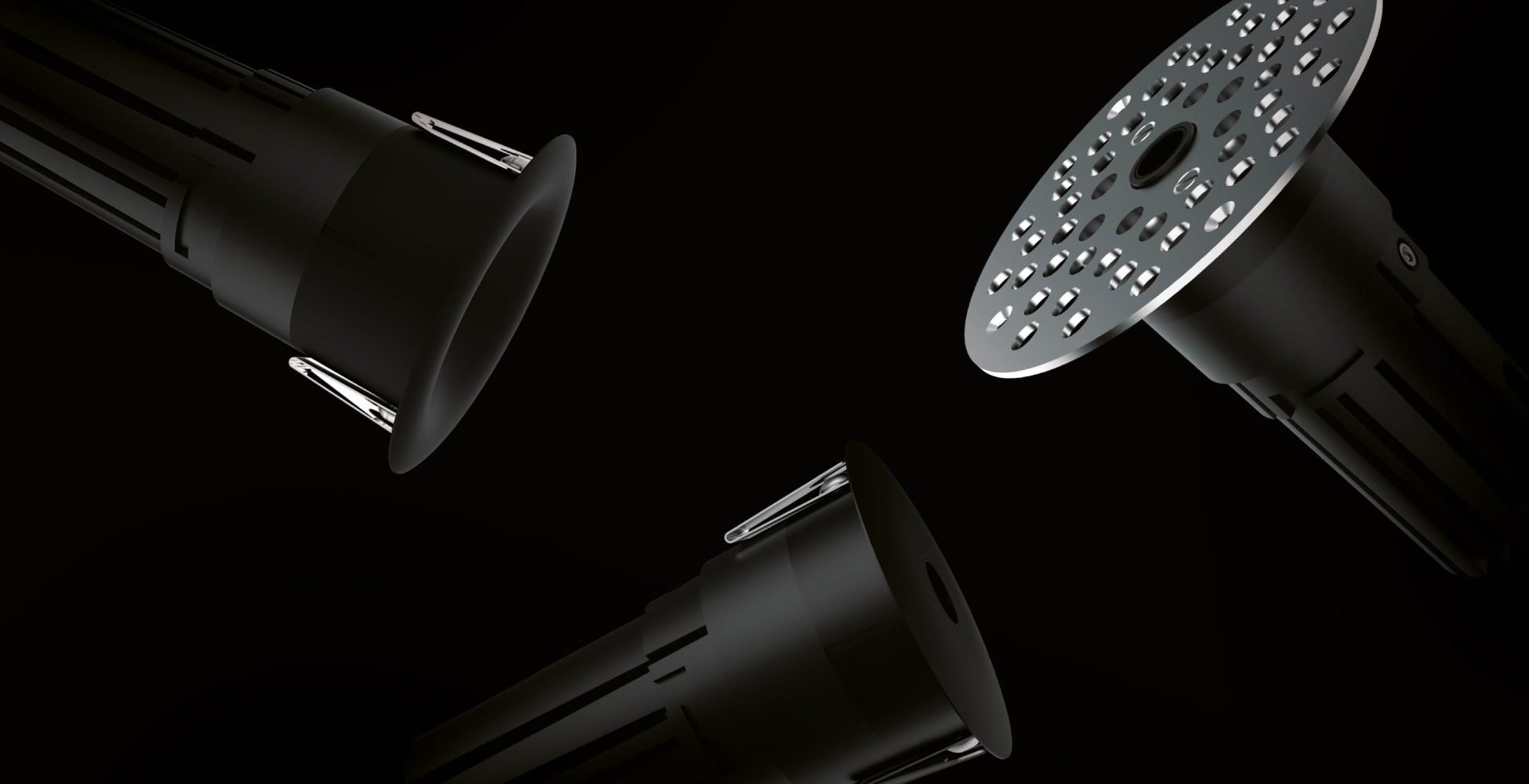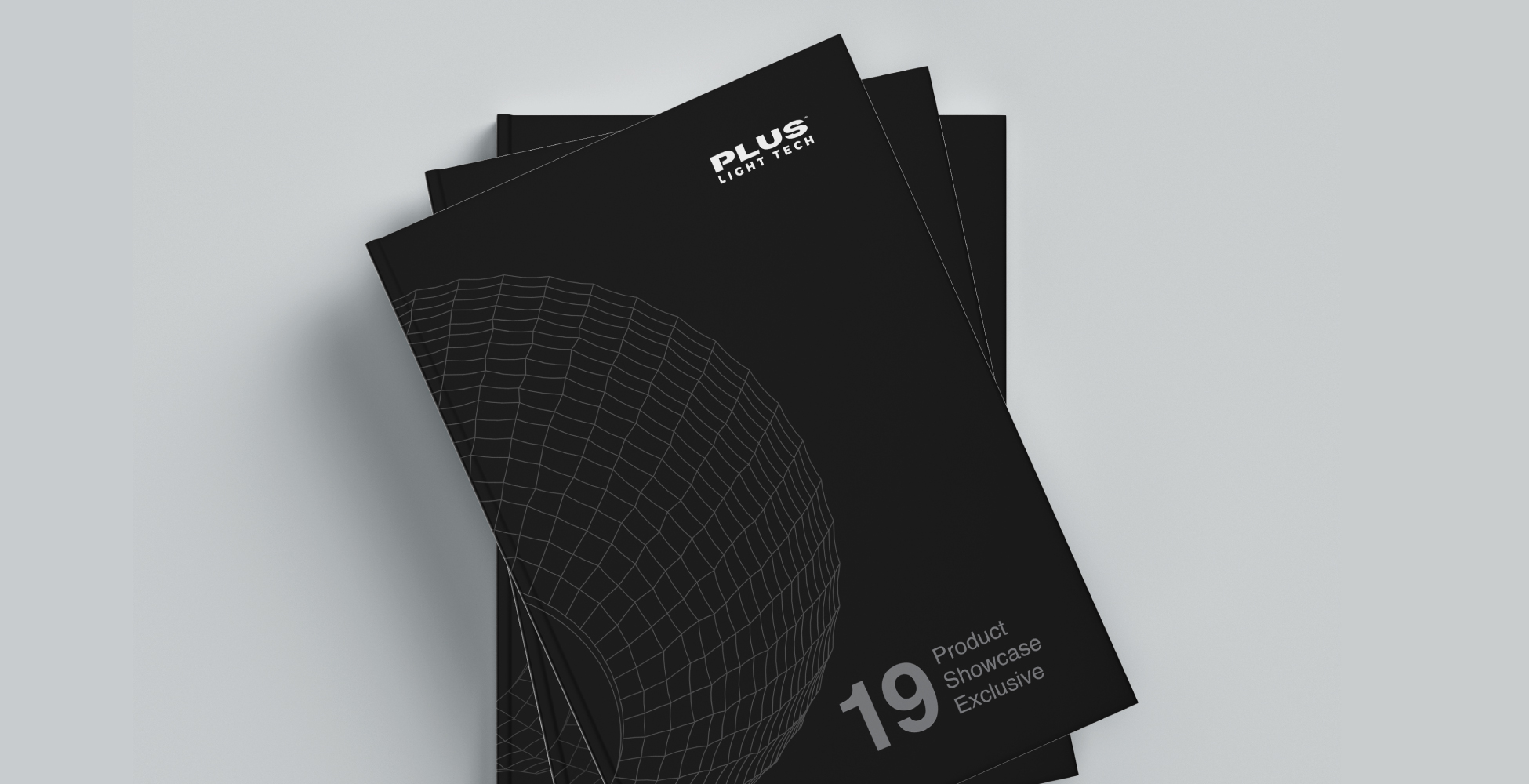
Plus are innovators in architectural lighting. Their breakthroughs in lighting systems serve a new generation of luminaires that redefine lighting technology in the Indian market. The company has made a mark by relentlessly creating products that have stood a class apart, for the past thirteen years. But being that product-driven also led them to overlook their brand identity and communication in the due course. The Plus catalogue was a precursor to set the personality of the brand justifying its performance and legacy.
The primary objective of the brochure was to be a thorough compendium of all the products that fell under the exclusive ranges introduced by Plus. Moreover, there had to be a binding context of the company’s unrecorded history and philosophy. Subordinate layers of information had to be added regarding the certifications, installation processes, accessories and devices that are offered apart from the products, etc.

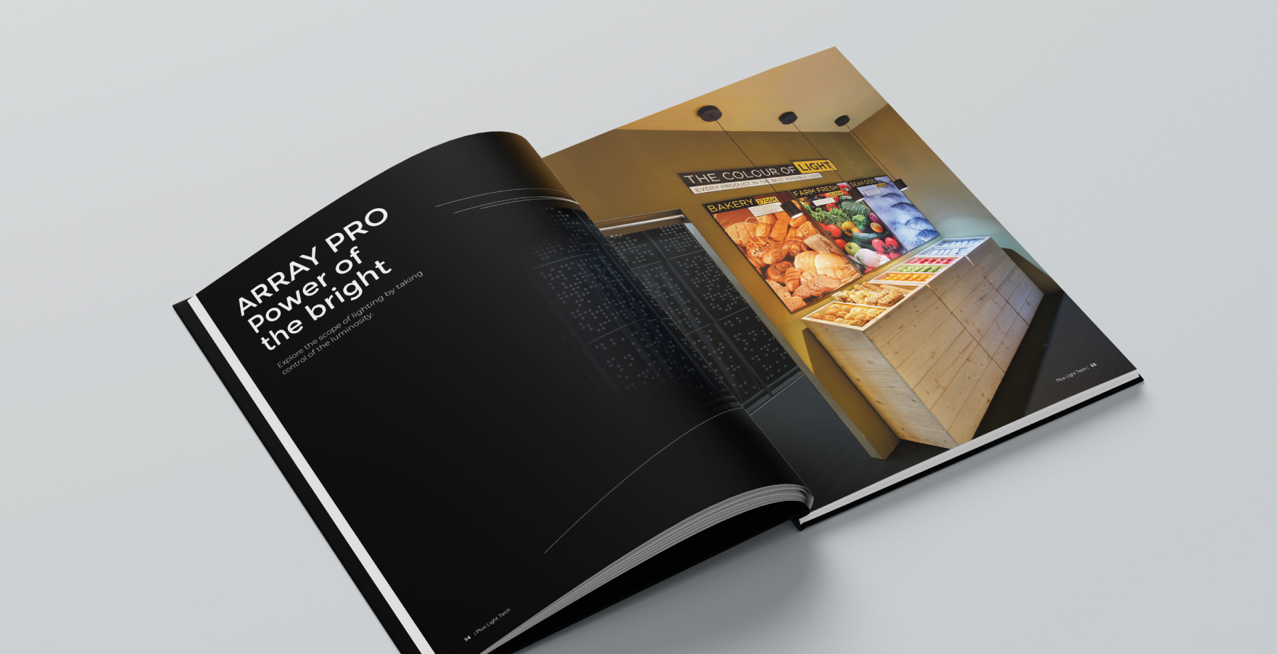
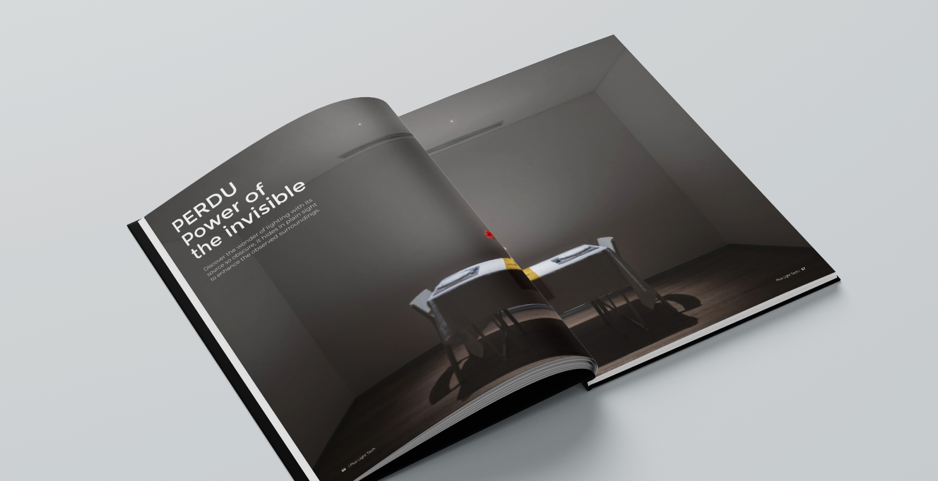

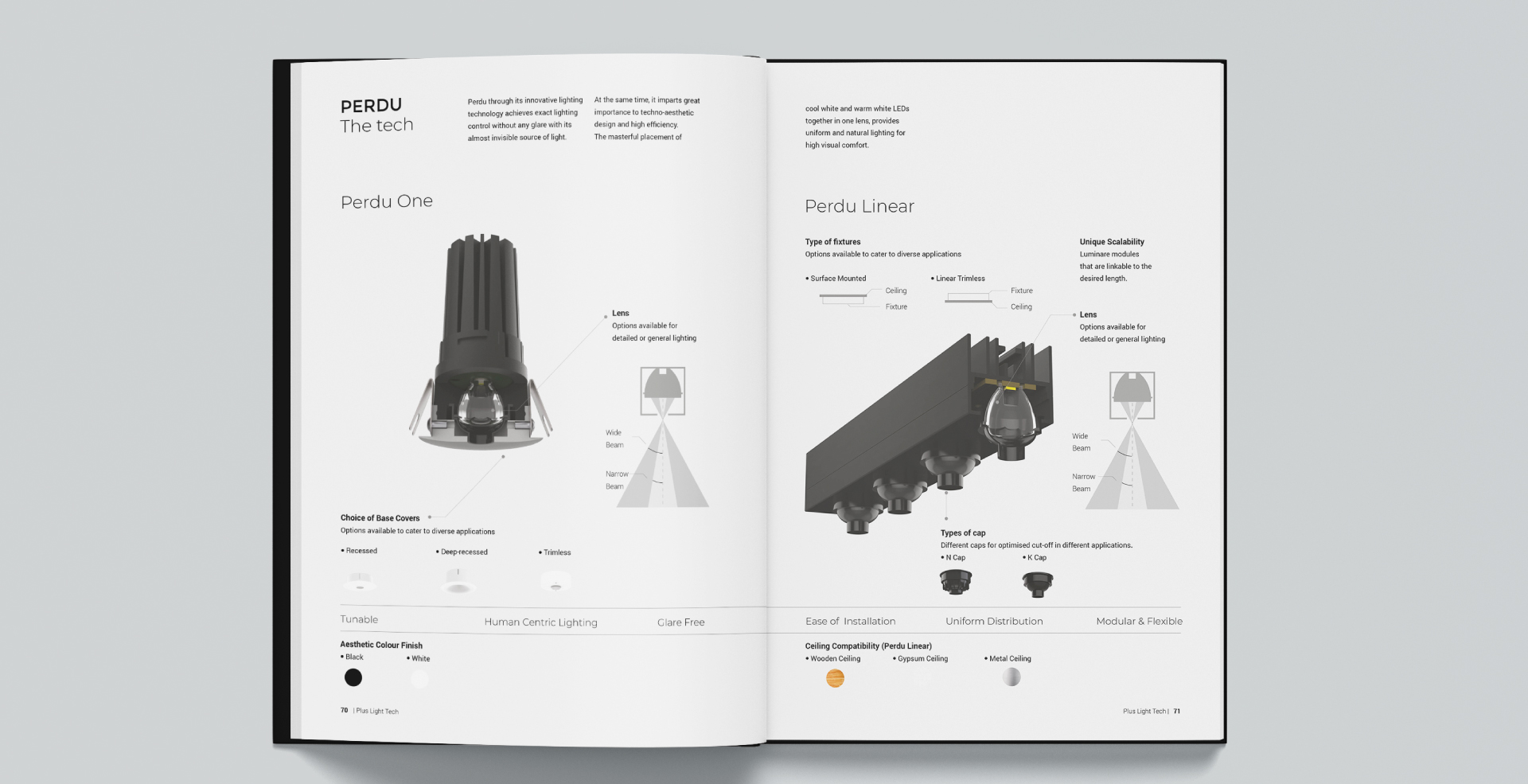
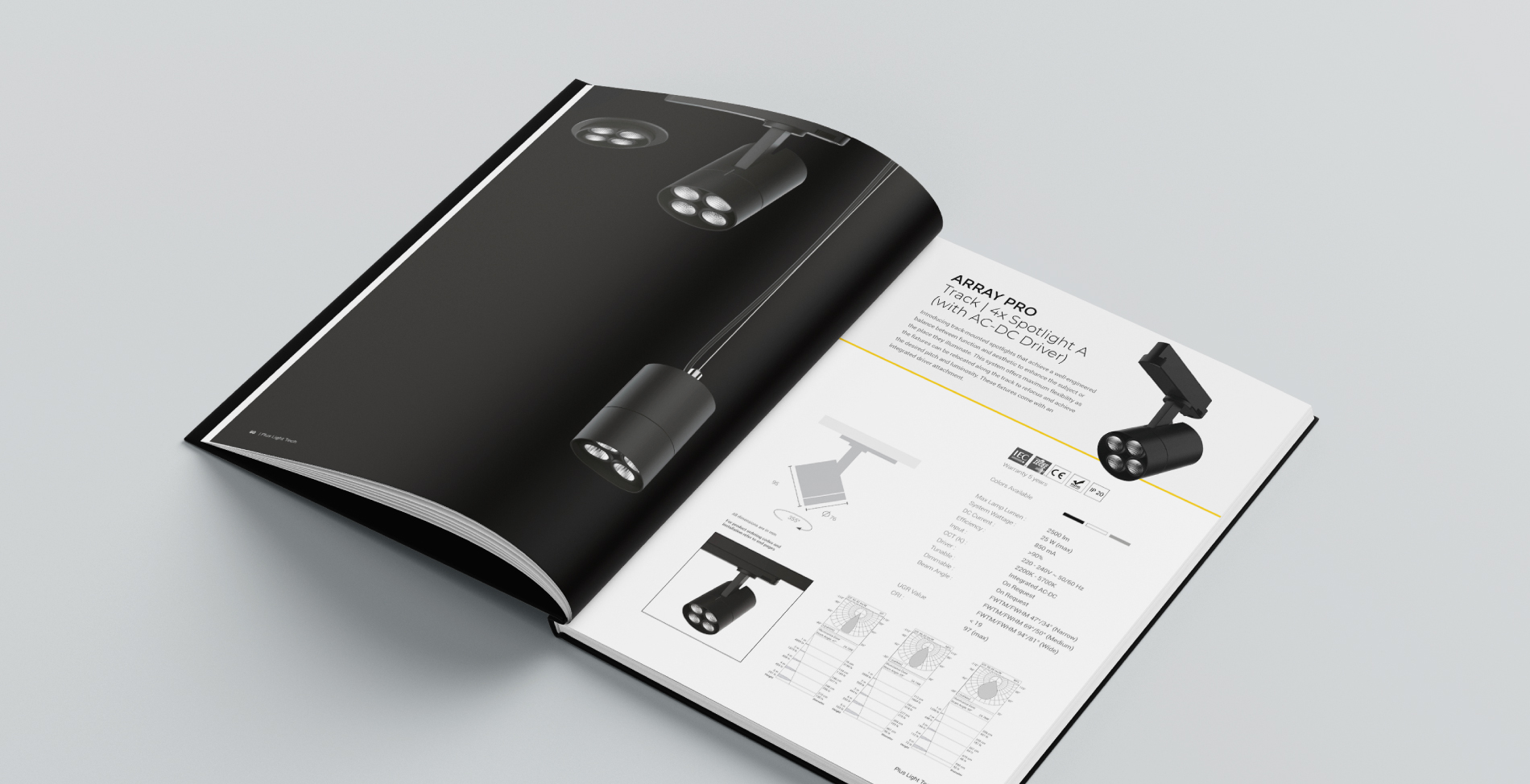
As we took a deep dive into the subject matter of the brochure, we realised the intricacies of it. There were 70+ unique products that panned in front of us, needing to be segregated on the basis of their range, application, and other specifications. The technical details were pivotal but needed to be displayed in a way that did not look jarring to the eyes, like studying a datasheet of the company’s offerings. Each one of the four ranges was given a character based on their unique functionality. The products were colour coded based on their applications.
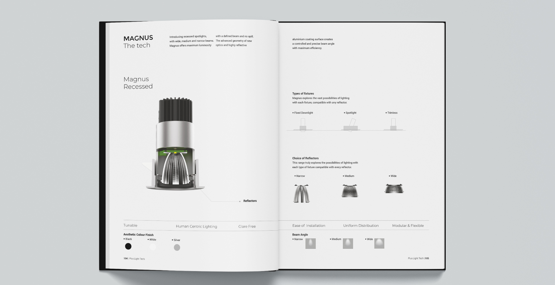

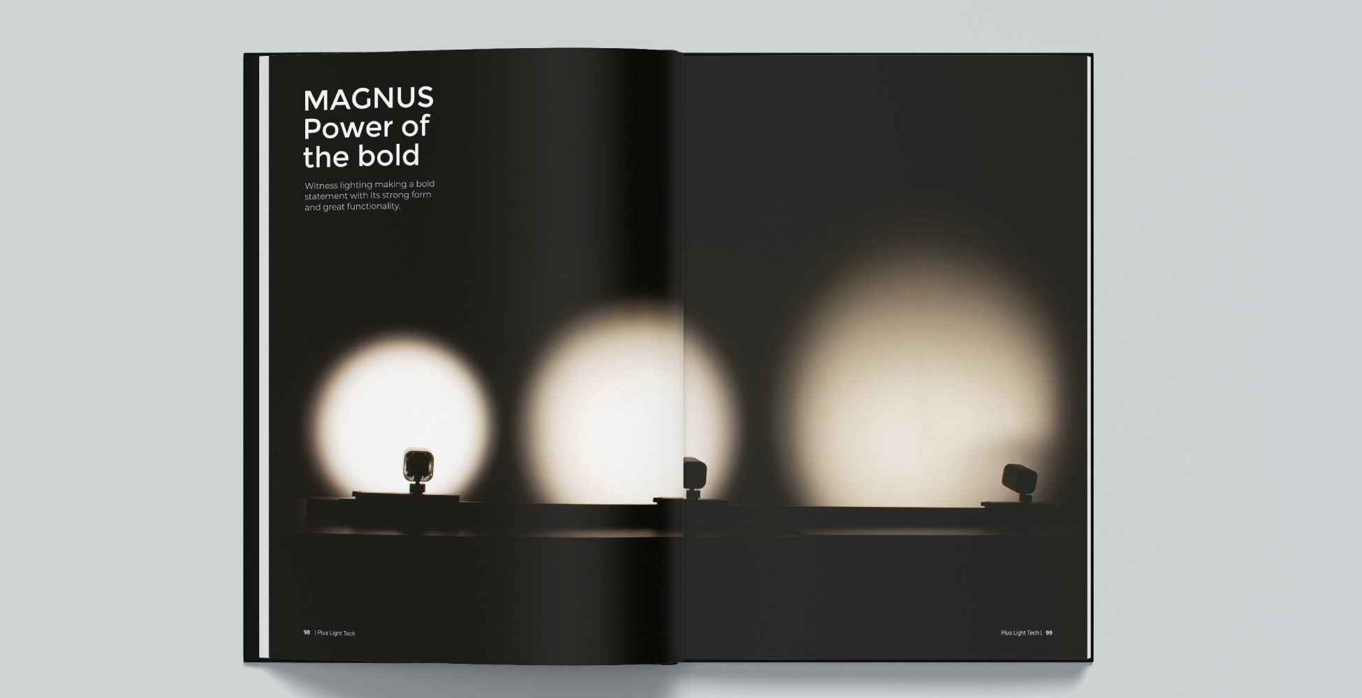
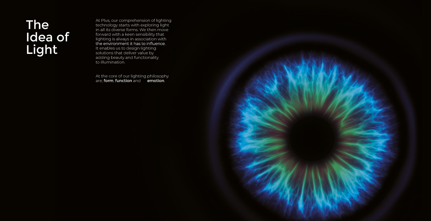
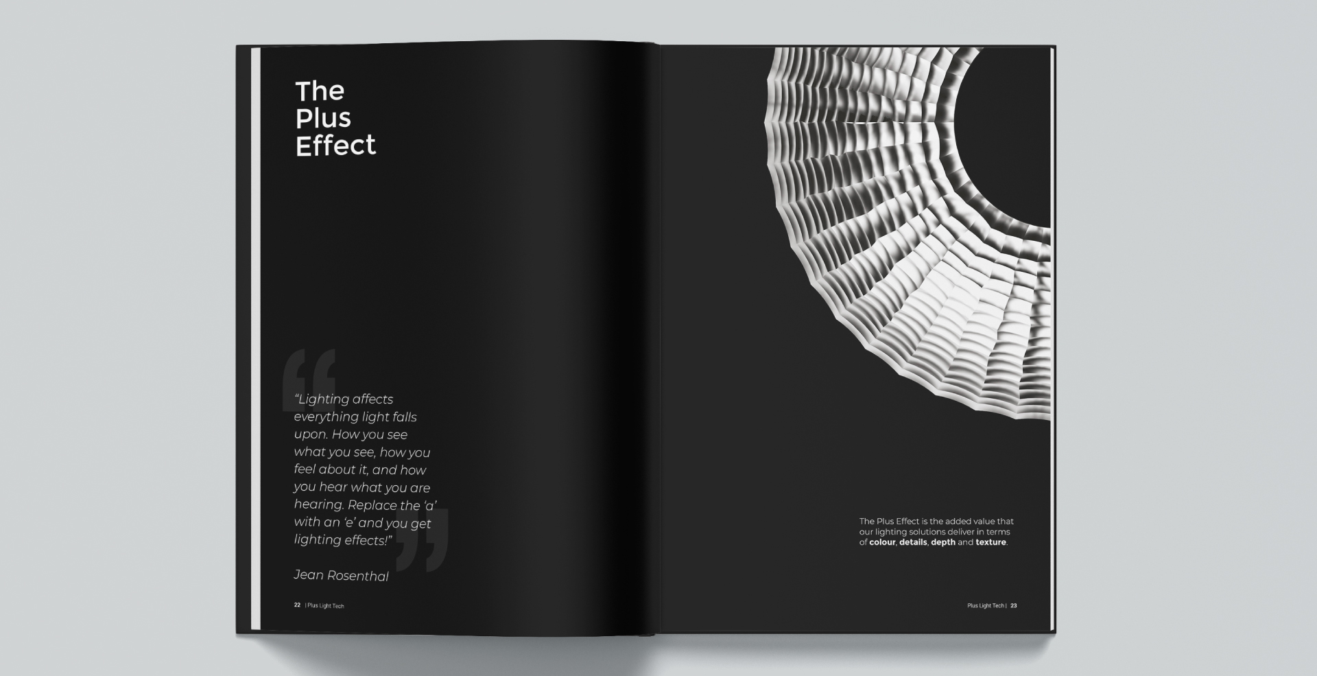
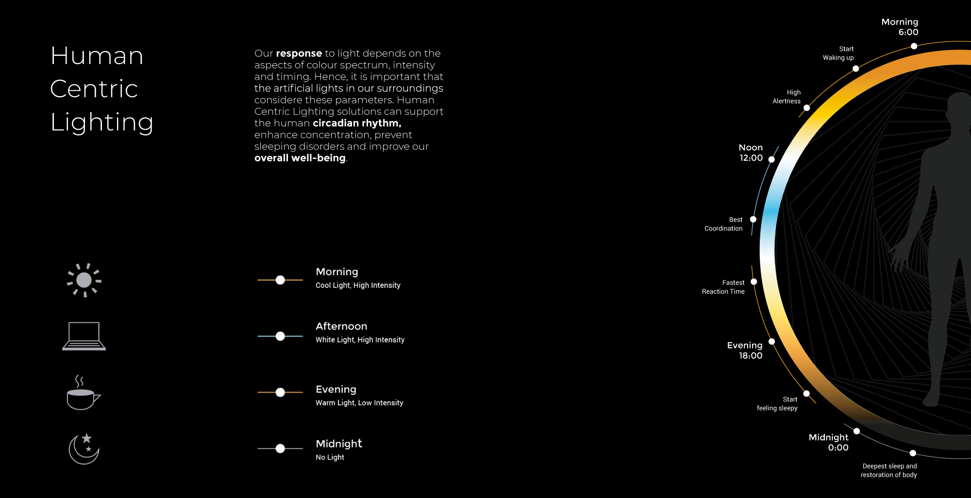
The philosophy and contextual information is easily the most alluring part of the book. We developed a language that captured the reader’s emotion of the fascination around light and then introduced the products that aspire to stir the same wonder through their performance and design. We take pride in the fine visuals that we developed for the publication. Starting with the renders that were created in-house and brought the exclusive technology of the products to life on paper. Also, the photometric drawings that attest to the functionality of the lights were a job done with meticulous regard for calculations.
Much of the design of the catalogue was internally inspired- by the core company values, what they do, what their vision is. The intention was not to brand a fancy face-lift but a true, clear voice that it deserved.
The Lighting Showcase 2019 was the first building block of the brand- a bespoke representation of a company that never sees lighting independent of innovation.
