


The book Mithila Art is an unbiased take on one of India’s most recognisable indigenous art forms, Madhubani or Mithila art. This particular art form has a deep-rooted significance in both the local arena and the national stage, and this book goes in-depth regarding the lives of artists and the history of the art form. It explores the history and significance of the Mithila art form, thought to be one of the most interesting found in India.
Designing such a book was quite challenging, but the result makes it a project to be proud of. The book stands apart from others thanks to its non-biased and comprehensive information. Nine different authors with unique academic or artistic backgrounds in Mithila art have contributed to the book to ensure it is free of errors and bias. Due to the lack of existing information on the topic, the editors felt that a compendium such as this was necessary for anyone interested in Mithila art or Indian folk art in general.
The book’s USP is its bais-free accounting, achieved by nine chapters, each written by different authors with differing perspectives and viewpoints. This serves to turn the book into a bible for everything Mithila. As we go through the blog, we explain how this USP was occasionally a challenge and a blessing.
Our design team faced three main challenges on this project, each of them quite different from the last.
The first challenge was creating the designs around huge huge text blocks while respecting the different perspectives of each chapter, pushing the designers to be inventive with their designs to create a book that works well with the blocks of text, infographics, and pictures.
The second challenge was the thematic variations in each chapter. Every chapter is unlike the ones before, with a new author espousing different viewpoints. To reflect this, we had to create unique designs for each chapter, while still maintaining an common overarching layout tying it all together while still maintaining a common overarching layout tying it all together.
The third and final challenge was maintaining the balance between text and images. Although this book serves as a comprehensive guide to the Mithila art, it got rather text-heavy. Our designers ensured just the right amount of text, accompanied by enough imagery to make the chapters seem more digestible.
Redefine The Genre Of The Book
We at DFO conducted extensive research on the characteristics and visual language of various genres of books. After much research we concluded that for this book, we’d need to develop a layout that doesn’t align with a single genre but is a perfect amalgamation of two types of genres, which we chose to be that of a coffee table book and a magazine.
This was followed by collating a style that could perfectly fit what Mithila Art aimed to offer its readers. The book was made in the style of a magazine and a coffee table book, taking the best of both worlds and combining features such as a columnar grid, text-heavy layouts, full-bleed images, and super breathable layouts, and more. The team also read up extensively on Mithila art from several contemporary sources, seeking inspiration for the book’s designs.
The book’s format is quite distinct from any other of this genre. Our team utilised a three-column grid as the book’s layout to ensure more freedom in terms of layouting. The result is a book perfect for inspiring and initiating conversations on the Mithila Art.
These choices create the book as we see it now, a perfect blend blend of unbiased and diverse viewpoints covering every aspect of the Mithila art form that has been researched so far. Despite the presence of these unique perspectives in one book, the book still manages to bring them together under one umbrella, thanks to the book’s novel formatting choices.
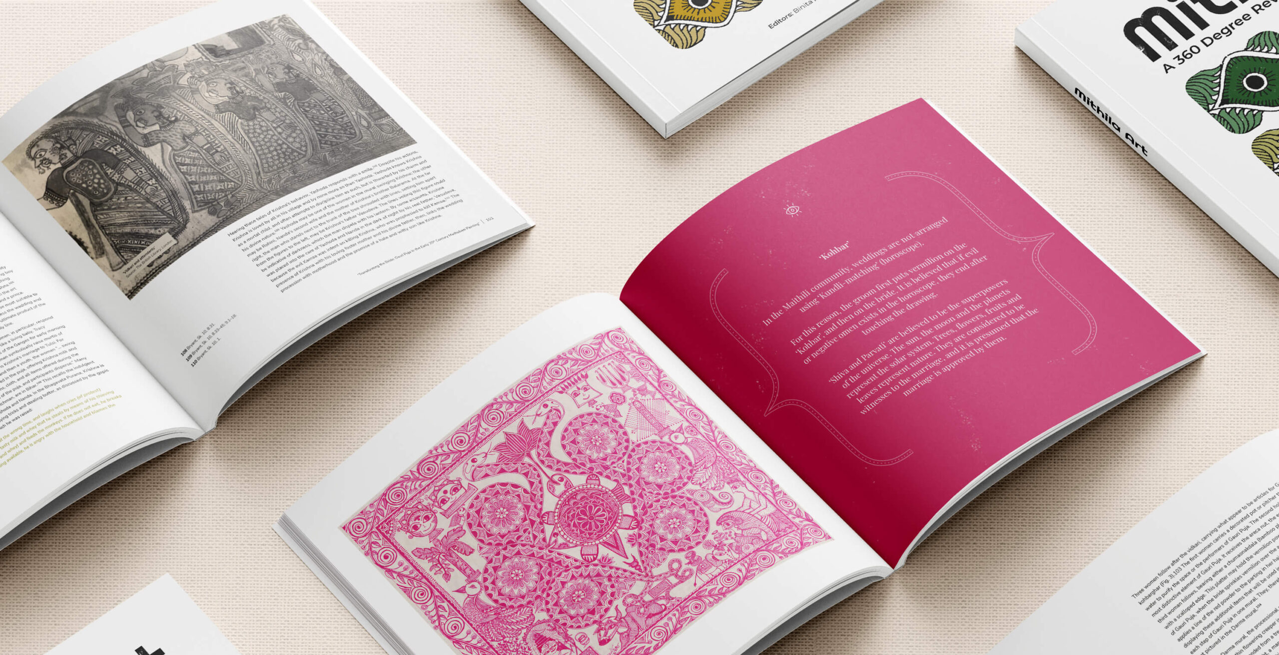
The book’s USP is its variation in perspectives, creating a script that is both factual and free of bias. A great example of the symbolism for the differing perspectives is the book’s cover page. It shows nine uniquely coloured eyes in the traditional Mithila or Madhubani style, with each eye corresponding to one chapter. Upon closer inspection, you can make out the designer’s attention to detail: each eye is coloured based on the chapter it corresponds to. This gives the book a unique look and feel to each chapter while still giving it a holistic feel.
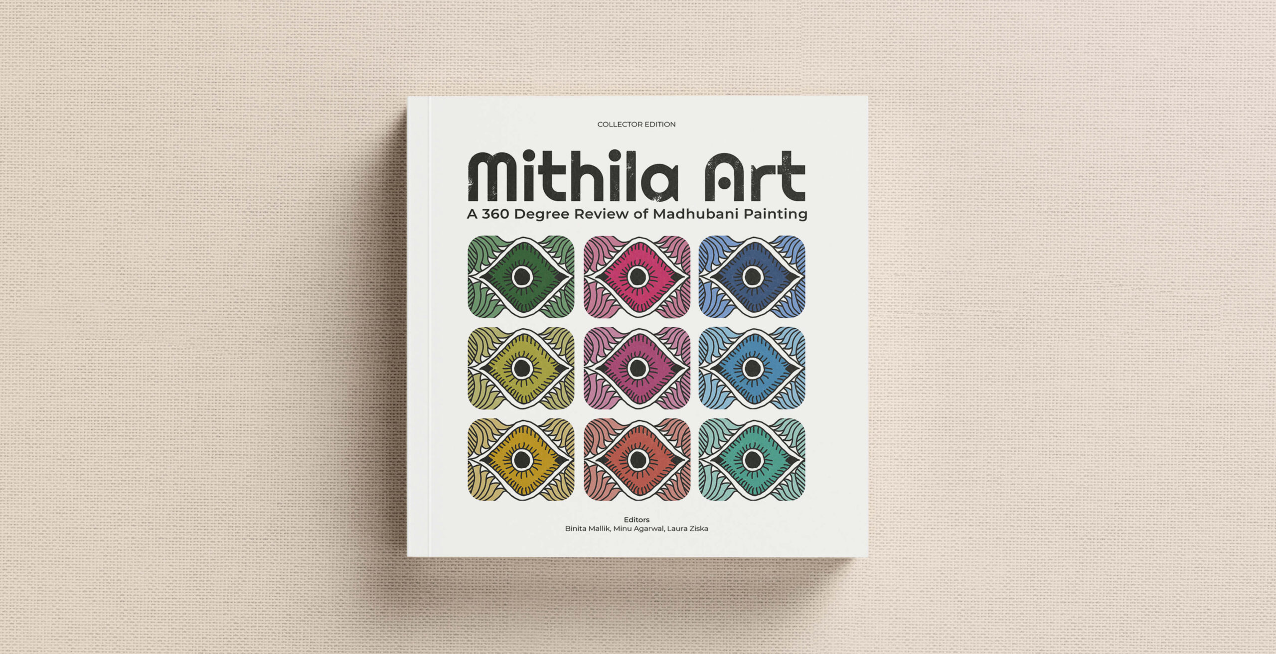
Another key element to look out for in this eye based representation is the symbolic meaning of an eye, i.e., a viewpoint. Each of the nine eyes comes together in one book; the number nine stays consistent, with each of the eyes representing one particular topic, viewpoint (history, features, reviews, etc.), and author in the book.
The book is intended to act as a one-stop source for everything related to Mithila art, giving readers a complete overview of the research in the field of Mithila/Madhubani art. Visual cues such as graphs and diagrams aid the reader in gaining a complete understanding of the subject matter.
Each chapter contains something unique: starting from a summary of what we already know in chapter one to the equivalence of art and education in chapter nine, the book provides a comprehensive review of the Mithila art style as a whole. From the cover to the end with deeper significance than a first glance lets on. Since red is an auspicious colour in Indian culture used to mark beginnings, red is the colour of choice when picking a theme for the book’s opening pages.
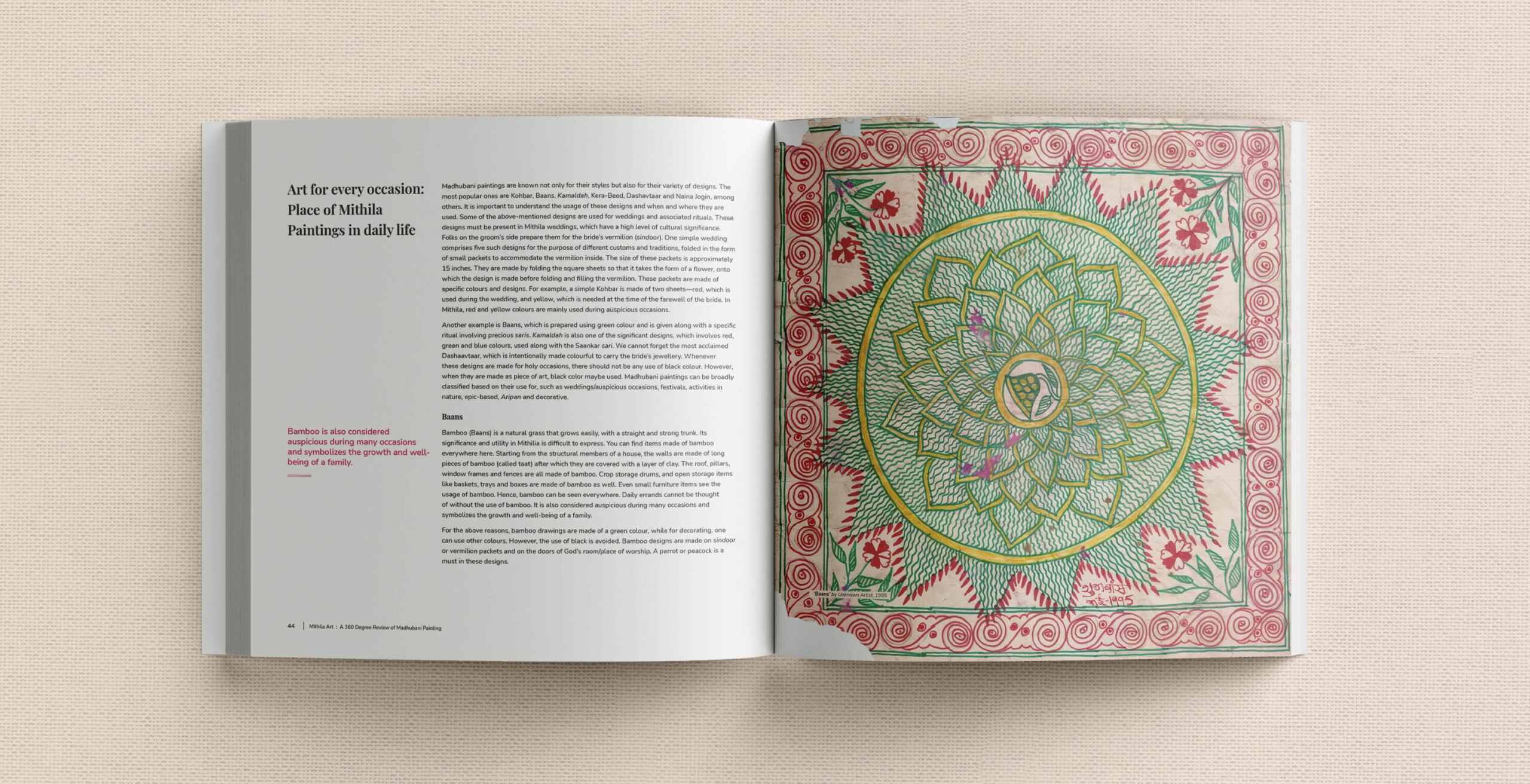
The book has a hierarchy of information on its pages, with the main body of text taking precedence over the rest, closely followed by the points highlighted to give a quick overview of the page. To avoid monotony, page breakers on every section space the flow of text that could potentially turn boring. Last but not least, infographics in almost every chapter relay information in a condensed format that is easy to understand. This hierarchy of information adds a level of depth to the book’s pages, using the distinct layout to help readers process the information faster and with next to no difficulties.
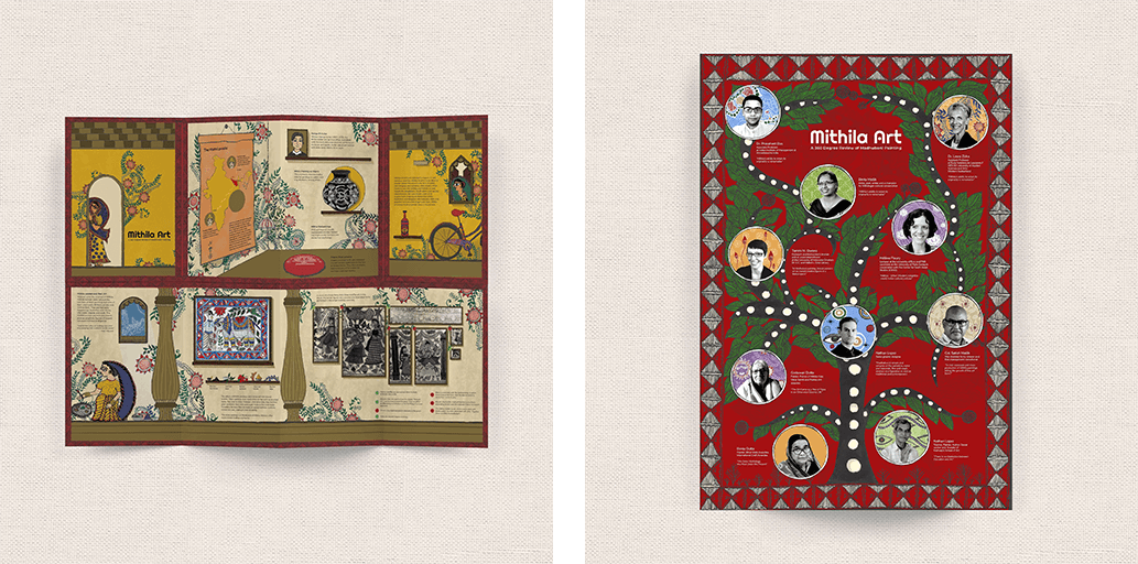
Mithila Art, though primarily a book dealing with the prominent artists engaged in the art form and their histories, along with the cultural and historical forces that have paved the way for Mithila’s global renown, is paired with a supplemental zine, providing the book owners with a quick summary of the contents alongside a large number of pictures. The book’s accompanying zine is perfect for libraries and educational institutes, complementing the in-depth information present in the book with a summary perfect for light reading. Hence it exists as the perfect companion to the book it comes with. All of this comes together to create a book that serves not just to educate the masses but to entertain.
This book ties together all of its connected yet seemingly disparate elements, largely in part thanks to its unorthodox and inspired art choices. It unifies all the different narratives each chapter offers to deliver an experience that provides a comprehensive history of the Mithila art, giving any would-be reader nothing more to ask for. The DFO team was beyond excited about working on a project such as this, with its international scope, and carried the project to completion with enthusiasm.
During our initial discussions with the editors, we quickly realised that this book would go on to change the world of art, particularly Indian art. ‘Team Mithila’ was a competent force, and we decided to accompany them on their aim to put Mithila Art on the map. Reading the book several times before designing its pages was a transformative experience that pushed us to stay true to the authors’ goal.
We are honoured to be a part of such a project as a studio and are ecstatic to be a part of the movement this book is attempting to start.