Consider Plus- the universal sign of addition. It signifies adding value, being more, being better- all attributes central to Plus Light Tech, an Indian company of architectural lighting fame. Well, Plus as a company has another trait that strengthens its brand proposition: precision. The company, through its products, practices precision in the sense that the production process meticulously complies to safety standards. The lights are efficient and seamless. The design is clean, sharp and minimal that lets performance of the luminaire be the hero, rather than the physical appearance.
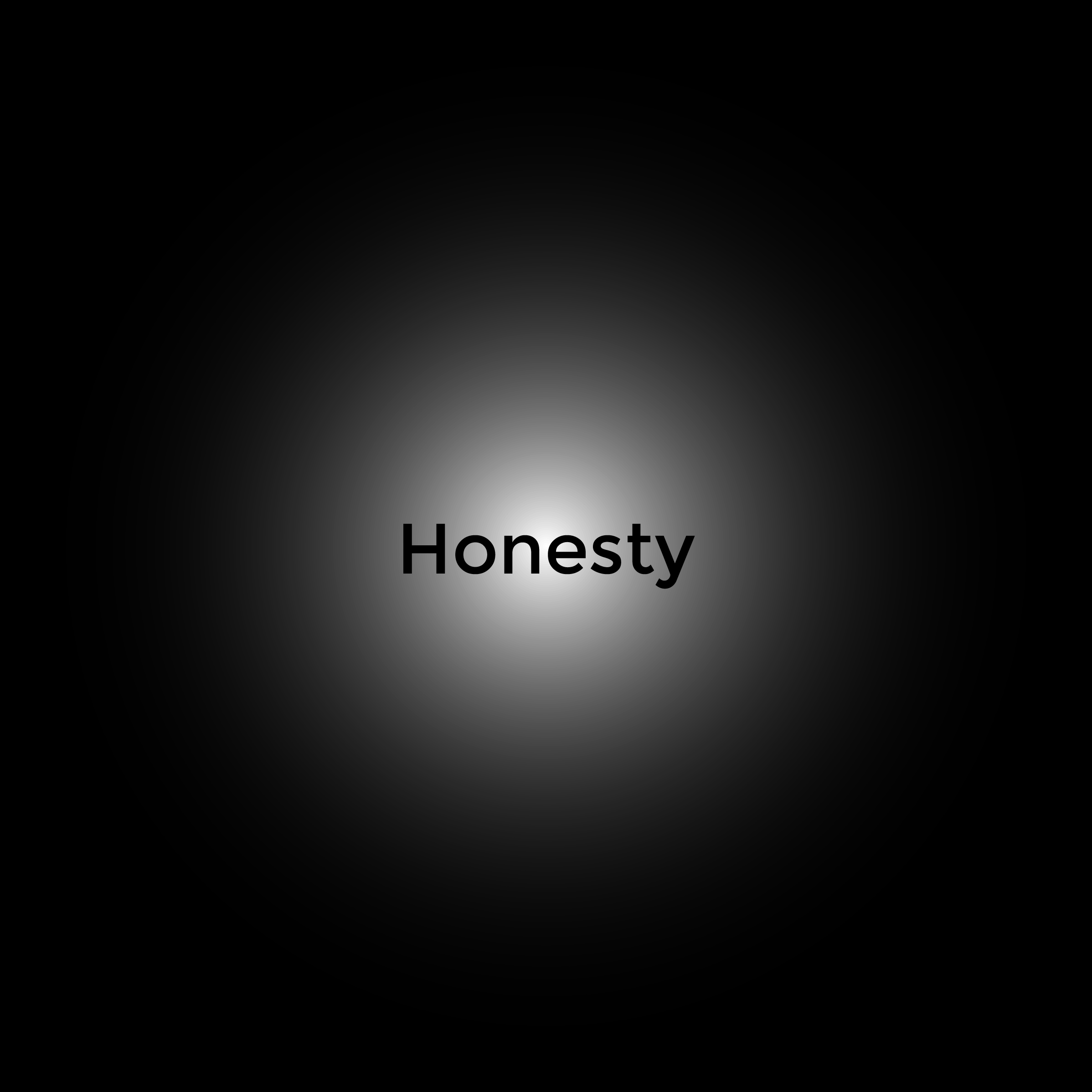
The people running this show are honest.
is what Amith Sheth (MD) has to say in the light of the company’s work ethic.
The 13 years of Plus’s existence have been a relentless pursuit of bringing the best of lighting technology in the Indian market with these three pillars as their business philosophy- Addition, Precision and Honesty. In fact, they had been so product-focused that in the due course they might have overlooked their brand image and visual communication. And hence, when the time came, we reintroduced the brand as what it truly stands for.
We’d like to look at the brand revamp as a journey more than a process because as the company grows, the brand continues to evolve. We…only set the wheels in motion.
And we did so with a solid process
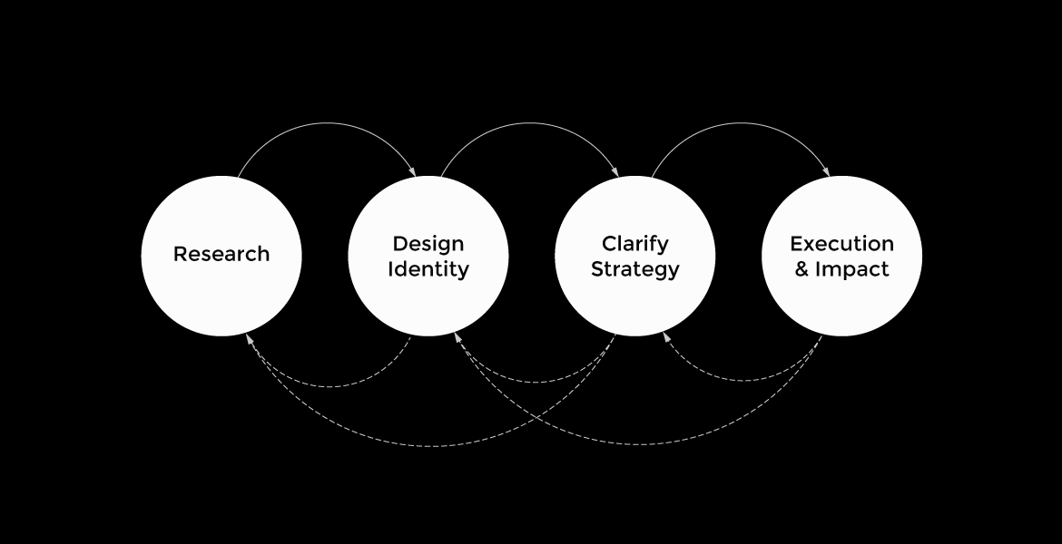
We started our research by taking a deep dive into the products, users and stakeholders of the company. The objective was to fully understand the market context in which Plus operates, as it is a retail company and does not cater to the end-user. Moreover, to familiarize ourselves with Plus’s technical processes and superior products, to articulate their value proposition.
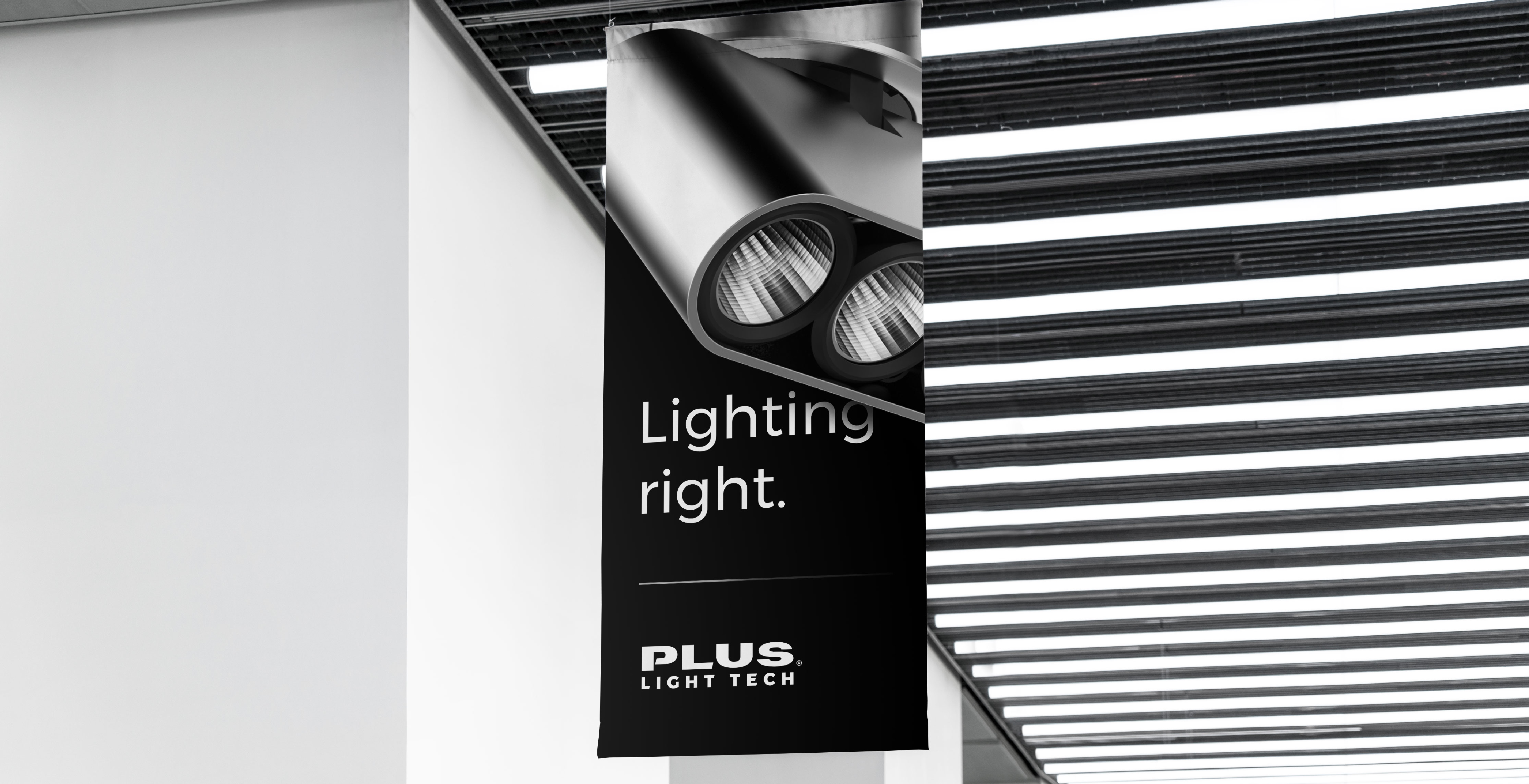
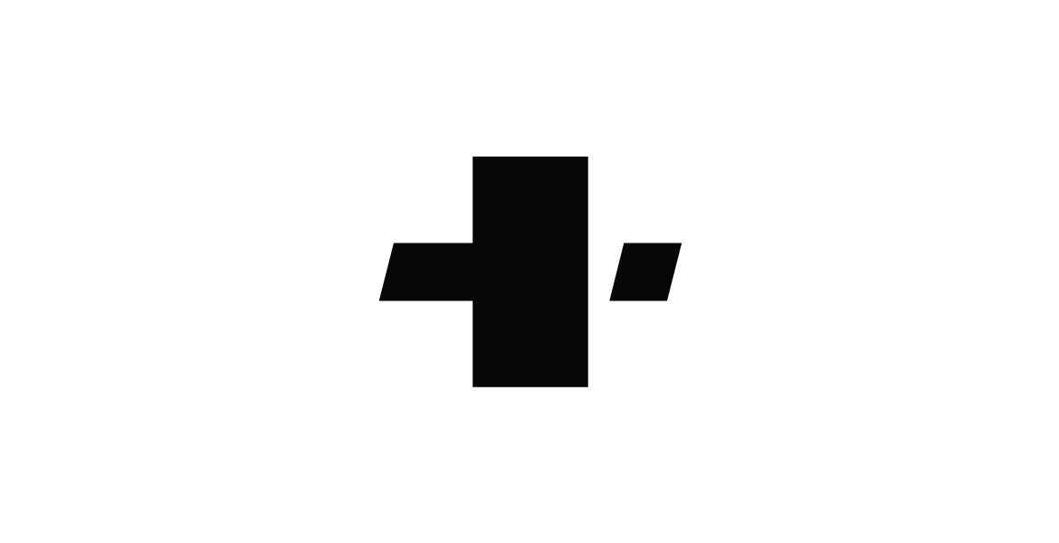
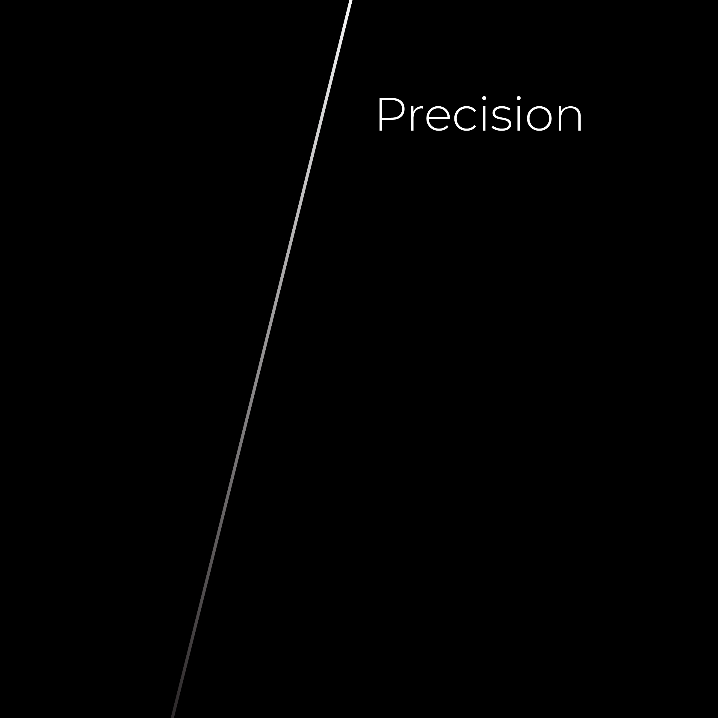
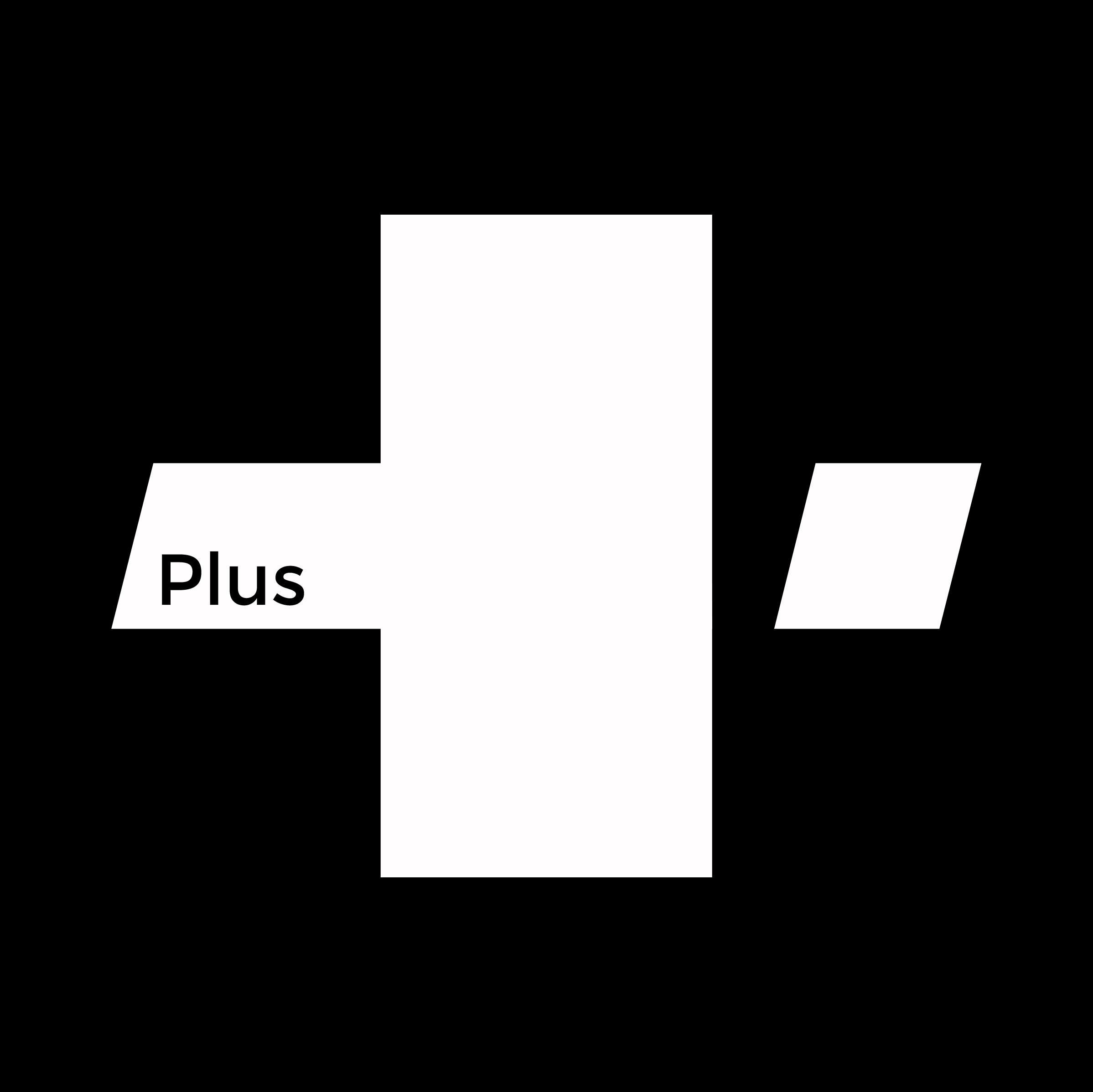
The new identity is not just a pretty logo but a powerful asset that conveys all the three core values. It takes the shape of the ‘plus’ sign and just look how the line of precision cuts the arm at a calculated angle. All this plays in black and white only, as unambiguous and honest as the company is and the brand wishes to be.
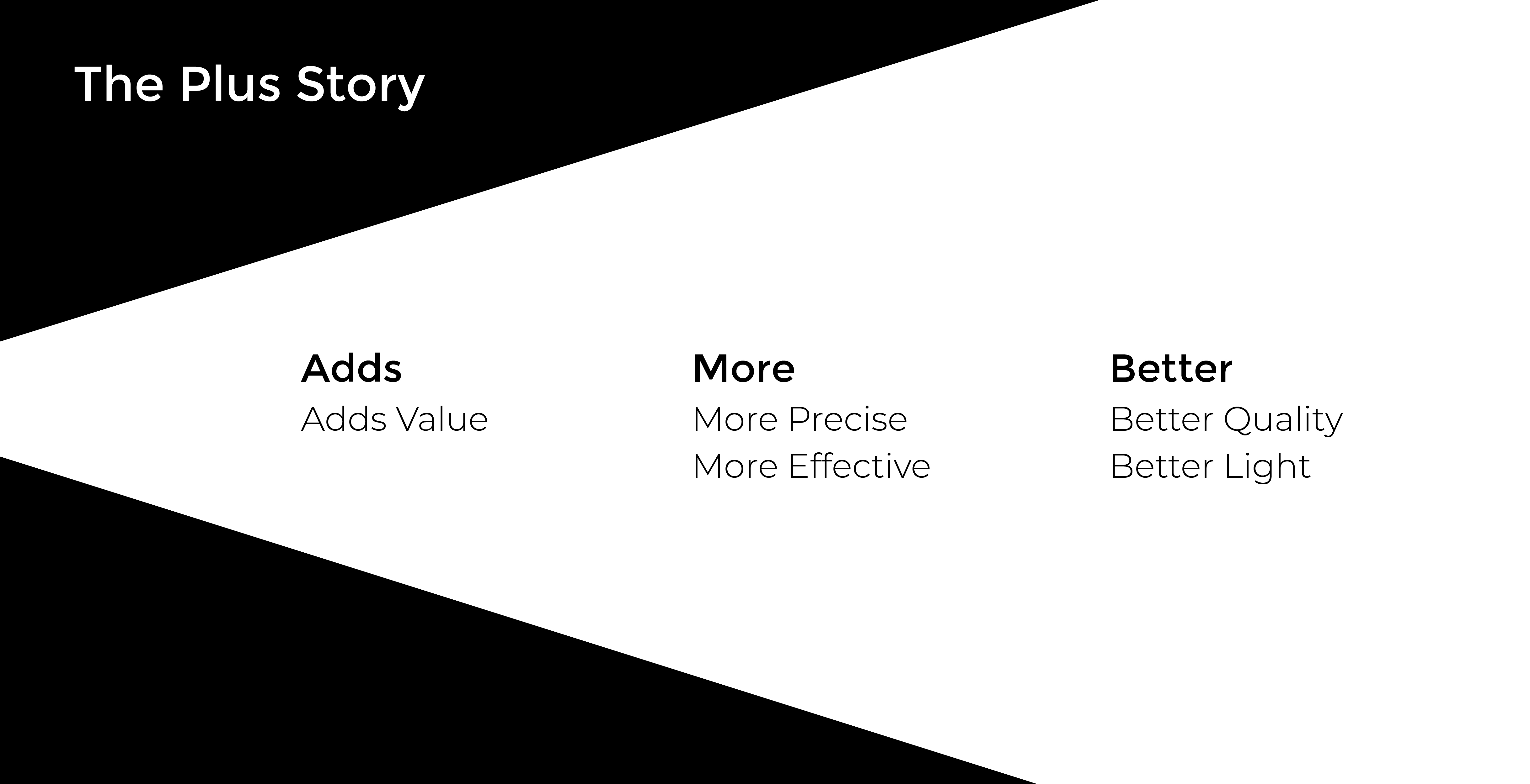
While clarifying strategy, we locked down on the essentials every piece of the message should have to be a stand-alone representative of Plus. These were…
Visual – The visuals used in all communication will be inspired by and follow the design aesthetics of the Plus products- simple, beautiful and elegant.
Message – Adhering to the ‘less is more’ philosophy, the language used in all communication should be exact, succinct and impactful.
Precision – Precision refers to developing communication that cuts through the noise and speaks clearly of what we want to say, without any ambiguity.
Addition – Addition is simply what “more” Plus offers. It emphasizes the benefits that go a step further than just functional lighting.
The biggest advantage of the logo being so bespoke is that it can be used to the benefit of creating appealing marketing material across mediums.