Siemens is a multinational company that works primarily in the field of Industry, Energy, Healthcare, and Infrastructure & Cities. Their India division reached out to us, to redesign the user interface that is used to control their HVAC (Heating, Ventilation, and Air Conditioning) Systems. Such systems are commonly used in large building compounds, such as hotels, malls, hospitals, airports, etc. The system we were tasked to work on was for a hotel building in Mumbai.
These interfaces are accessed by operators from within a control room at the respective premises. They need to be constantly monitored throughout the day, to ensure smooth operations, and prevent any sort of unforeseen malfunctioning. Hence it is crucial for the interface to deliver in terms of clarity and ease of information dissemination, to minimize the pain points and potential problems that the operators might encounter while accessing the system.
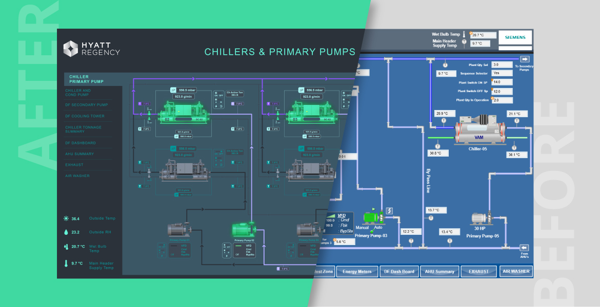
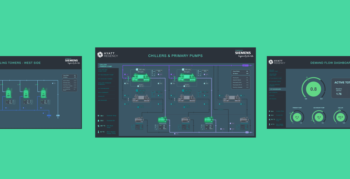
The existing interface that Siemens used in their systems was dated in terms of its visual language, which posed some challenges to the users. Certain indicators weren’t clear and the imagery was difficult to gauge. The overall experience wasn’t intuitive enough, for a product that was going to be used throughout the day, for every day of the week!
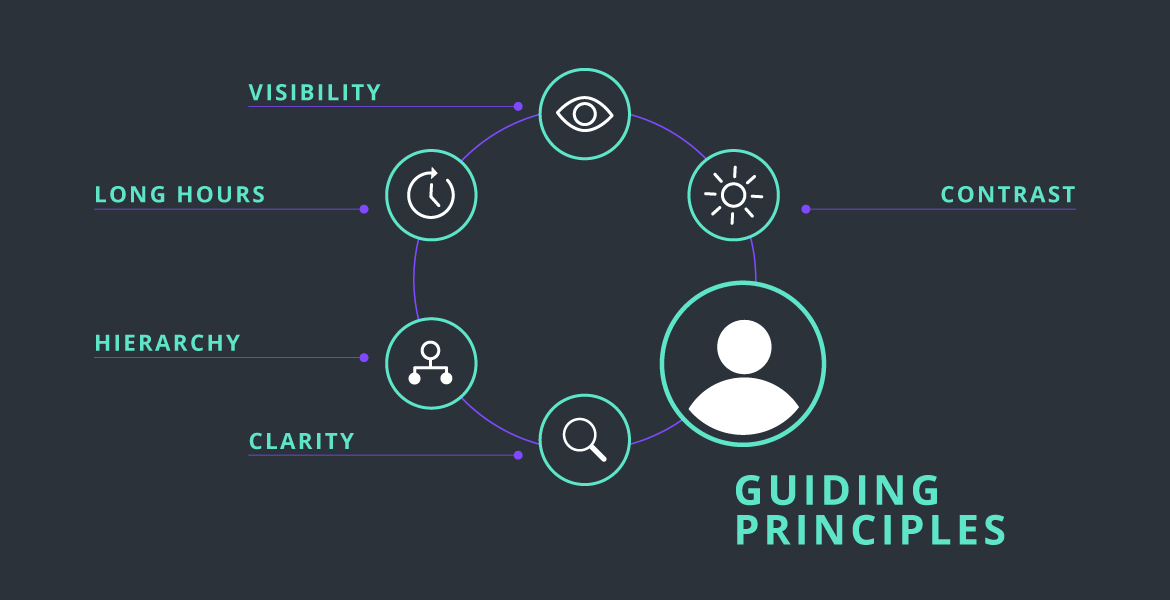
Based on our initial research and evaluation, we realised that a simple redesign wasn’t enough to tackle the hurdles. What the system needed was a complete change in its visual language. There was a need to establish hierarchy, and improve the clarity of information communication.
Our process usually begins with the user; in this case, the operators were going to be using the system within closed rooms, for considerably long hours throughout the day. Due to this, it was important for us to think about the contrast on screens, and try to ease their experience as much as possible. Darker interfaces tend to be easier on the eyes, particularly when the screen needs to be looked at for long durations, and when the interaction is happening largely indoors, and not under sunlight (lighter UIs are more favourable in brighter environments, like out in the open and under the sun). This retains visibility, and also reduces the potential of eye strain being caused in the viewers.

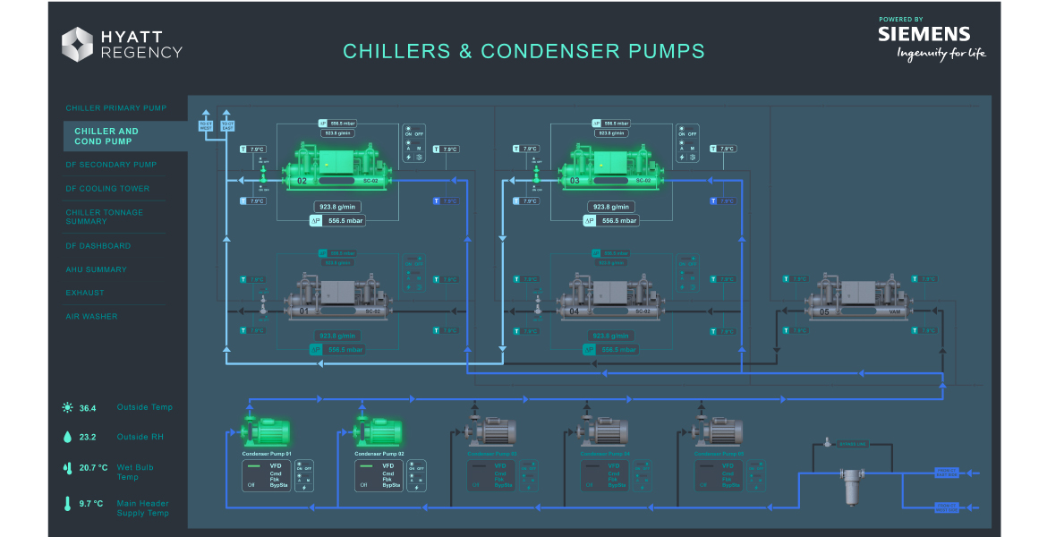
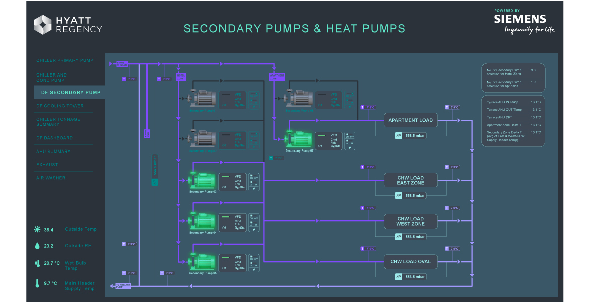
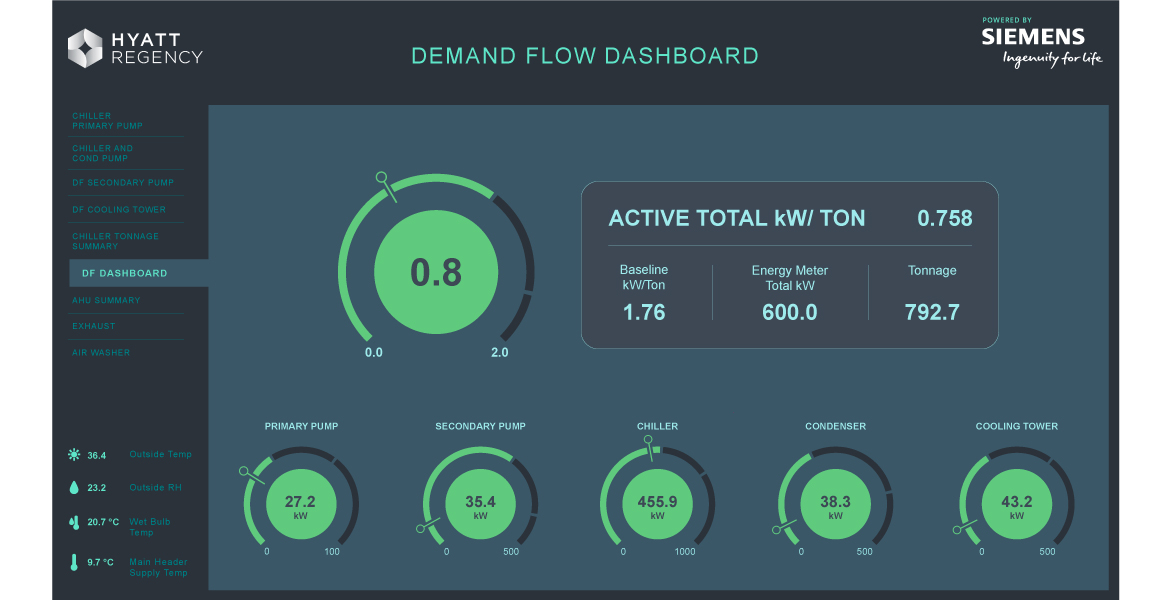
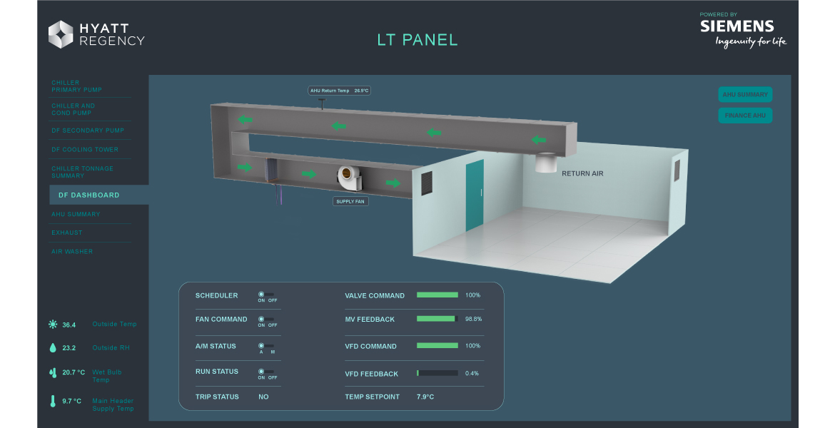
We worked with their engineers to understand how the entire system functions, and familiarize ourselves with the corresponding representations on screen. This process helped us to identify the gaps in the existing visuals, and also detect potential pain points in the user’s journey. These insights directly informed our main goals: reducing clutter and improving visual hierarchy, thereby making the interface more intuitive and easy to digest!
The plan was to develop a coherent and modern visual language for the interface, but at the same time, it had to be within their development capabilities. The software they were using to build these interfaces had some constraints:
So we had to be careful in our process, to stay within these design constraints.

We had to keep in mind the contrast and visibility of the various, oftentimes small, icons and numbers that occupied the screen. While easing the viewing experience was crucial, it had to be done without hampering the contrast and legibility of the on screen elements! So the colours were chosen with the intention to maintain sufficient contrast and high visibility, while giving us the range to introduce the required hierarchy.
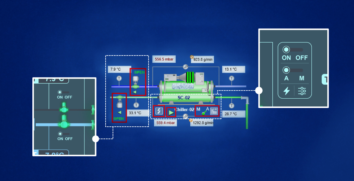
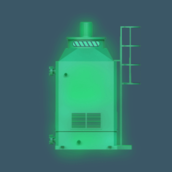
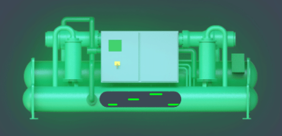
Another major aspect of overhauling the visual language was the imagery and iconography. We wanted to refresh the dated, clunky imagery with something that was more contemporary, and fit into the new, cleaner aesthetic. But we needed to ensure that their recognizability wasn’t compromised, so that the users don’t have to go through a learning curve to familiarize themselves with them! Keeping this in mind, we worked in close coordination with the industrial designers on our team to translate the imagery of the various components into a refined, consistent and modern aesthetic, while maintaining their skeuomorphic properties.