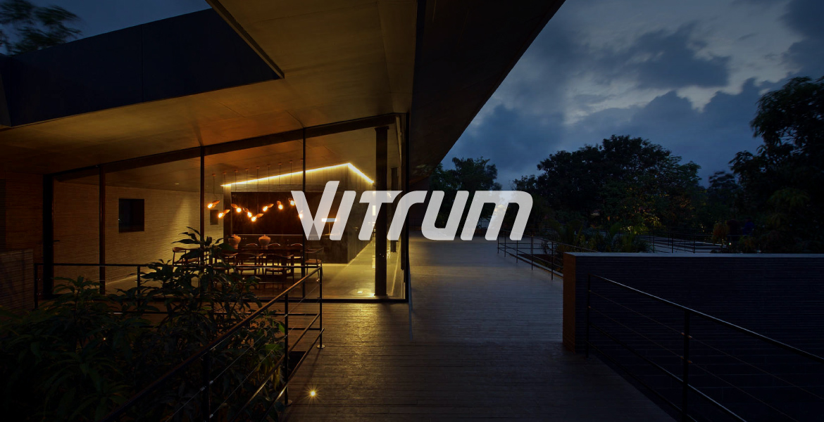
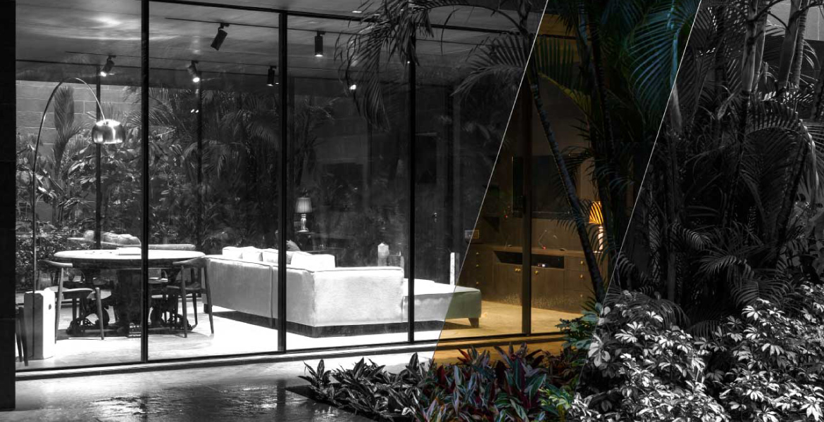
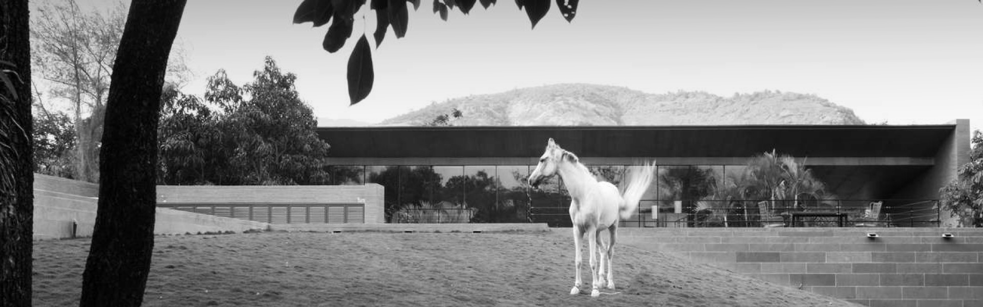
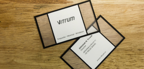
Vitrum is one stop solution for design, manufacturing, and installation of exclusive Slimline glass windows. Their offerings are set in a clean and elegant aesthetic. They collaborated with us to develop a brand identity that resonated strongly with their product and ethos.
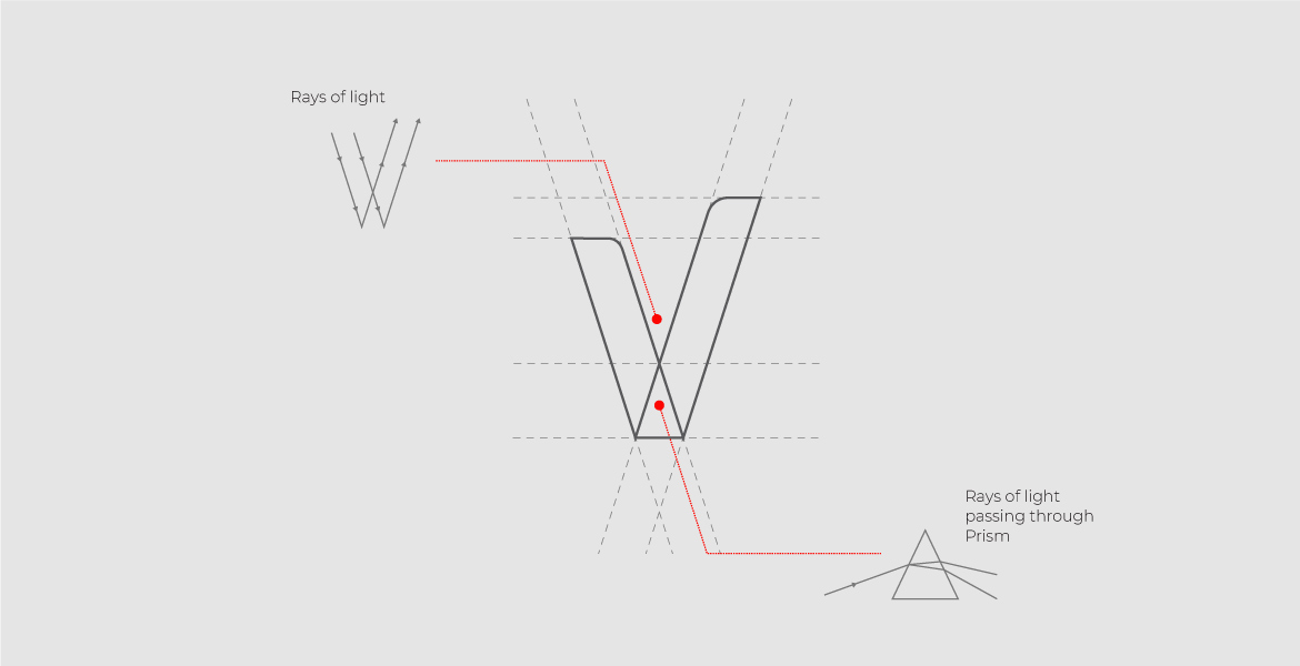
We started our process by considering the chief functionality of a window. By its exact meaning- A window is an opening in the wall or roof of a building or vehicle, fitted with glass in a frame to admit light or air and allow people to see out. We considered transparency of the glass within the frame that allows light seamlessly from the outdoors and how the rays of the light play and interact with glass.
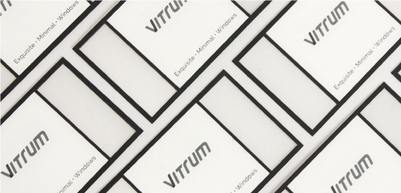
The design for Vitrum logo is inspired by the basic phenomenon of dispersion of light. The logo explored the endless possibilities of the interaction between light and glass. The logotype uses a neutral grey color which is contrasted and mingled with dynamic hues in the stroke of ‘V’. The grey stands for a close to minimal feel of a glass window and the vibrant hues offset the environment that the glass allows us to see.
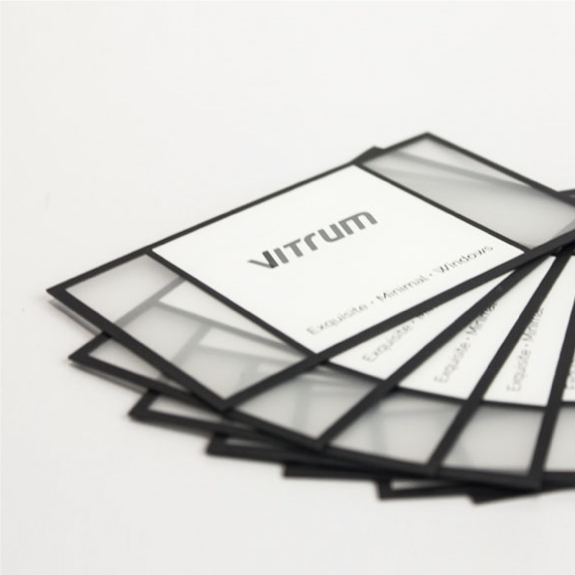
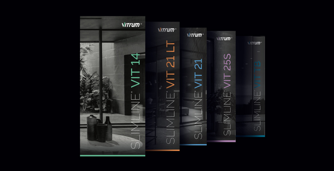
The design was then carried through in a series of exclusive brochures, keeping the identity intact while playing with dynamic colours.