


Work. Play. Communication.
Today, a smartphone isn’t just enabling these aspects of our lives. It’s indispensable to them. Nothing seems possible without the numerous devices we use day in day out.
With more than three billion people using smartphones at the moment, and 1.4 billion smartphones sold every year, it’s no surprise that billions of dollars of research, man-hours and innovation are dedicated to formulating the experiences that these handheld rectangular interfaces offer.
In 2021, you don’t have to be a geek to know that two operating systems reign over the cell phone world – Android by Google and iOS by Apple. While the iOS ecosystem is solely for the Apple devices, the Android ecosystem is open-source and fragmented.
Look around, and depending on the part of the world you’re in, you will find tons of Android users, or tons of iPhone users.
Our smartphones today come in a myriad of sizes and resolutions. For the sake of user experience, and efficiency in software engineering, there’s a need for regularizing interfaces and maintaining guidelines for a consistent experience.
Here cometh the Human interface guidelines for iOS and material design guidelines for Android. These are a collection of guidelines to be fulfilled when building apps for these two platforms.
Don’t scratch your head yet. We have a specially curated short and sweet summary to enlighten you on Android vs iOS user experience, design guidelines, and their distinctions. An iOS and Android design guideline cheat sheet, of sorts.
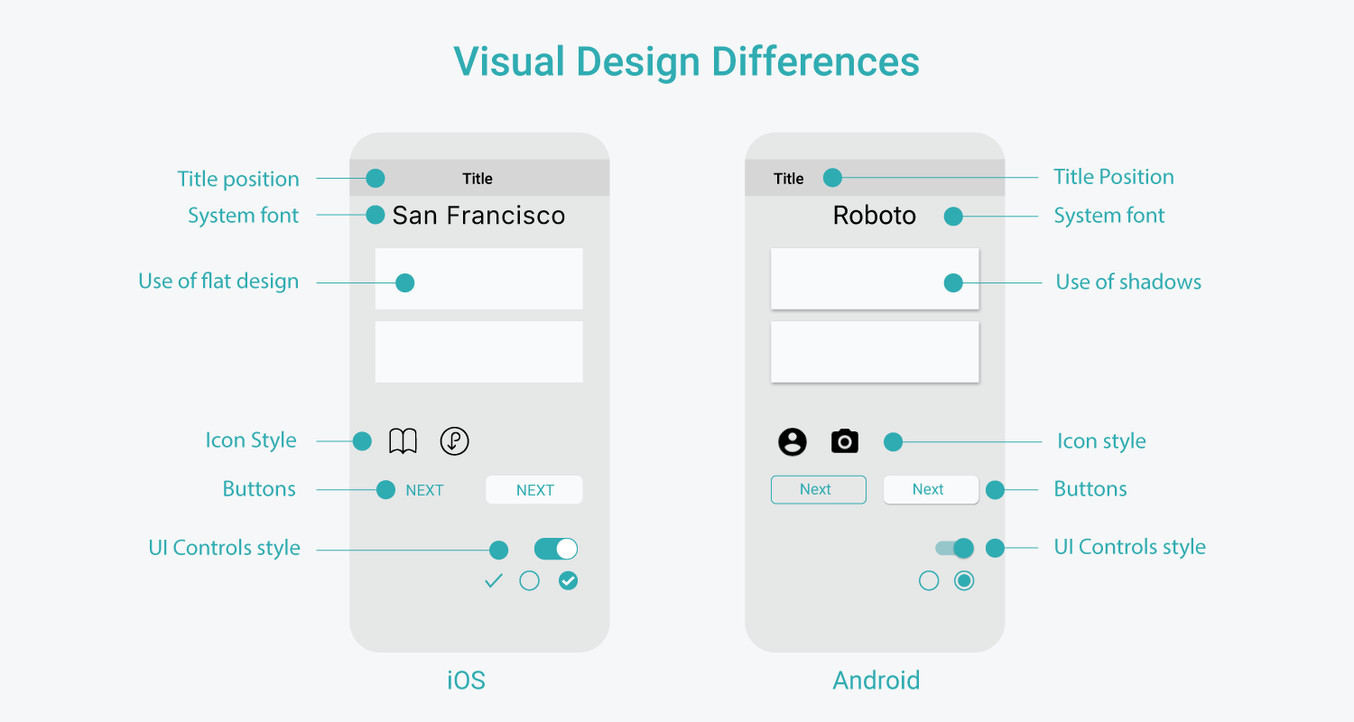
Let’s begin with iOS, whose UI has a flat design style. Its skeuomorphic features from earlier iterations have been removed. Android design relies on shadows to show hierarchy, and its UI resembles layers of paper.
iOS has San Francisco as the system font, while Android uses Roboto.
Ofcourse, elements like UI controls, buttons, icons etc., also vary. iOS uses centre alignment for the title, whereas Android has a left-aligned title.
Look closely, and in iOS, the title is often replaced with the brand logo. In the case of button styles, Android uses uppercased text, and iOS uses title cased text, though this rule can differ.
Both human interface design and material design guidelines define an assortment of button styles. iOS design guidelines dictate buttons that are more flat as compared to Android controls.
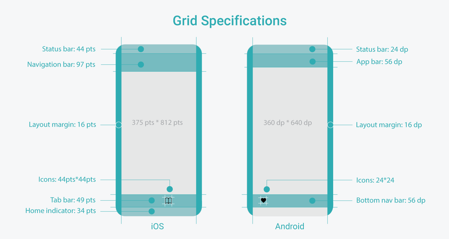
iOS UI is developed in points (pt). Android apps, with their material design guidelines, are developed with what are called density-independent pixels (dp).
The design needs to be within the specified safe area. In UI design, it’s regarded as a good practice to design for narrow screen size first.
According to iOS design guidelines, 375 pt is deemed the right screen size (width) for designing. For Android it is 360 dp.
Height is not a limitation when considering the screen size. The size of the navigation bar/app bar and tab bar/bottom navigation bar also needs to be followed.

Starting from the bottom – Android app UI design features the back button at the bottom, whereas on iOS, it is present on the screen’s top-left corner.
Primary navigation in iOS is called the Tab bar, and it is located at the bottom. In Android app UI design, the primary navigation bar finds itself bottom and is called the bottom navigation bar.
Android app UI design also features tabs for top-level navigation. Tabs in Android are for same level navigations, wherein segmented controls in iOS control the content on the same page.
iOS UI design features a ‘More’ button on the Tab Bar in the secondary navigation. In Android apps, we get a hamburger menu on the top left corner.
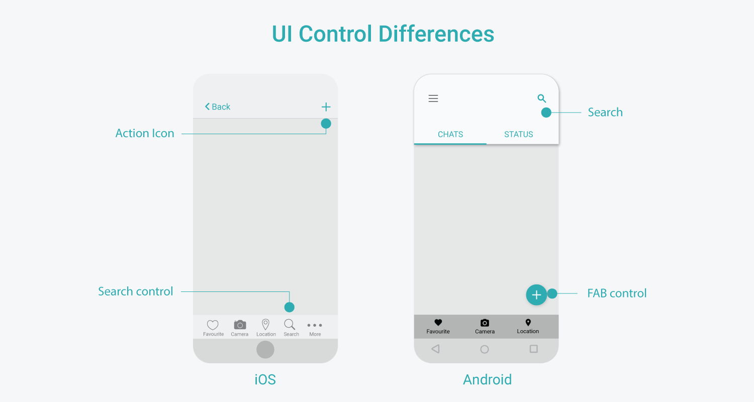
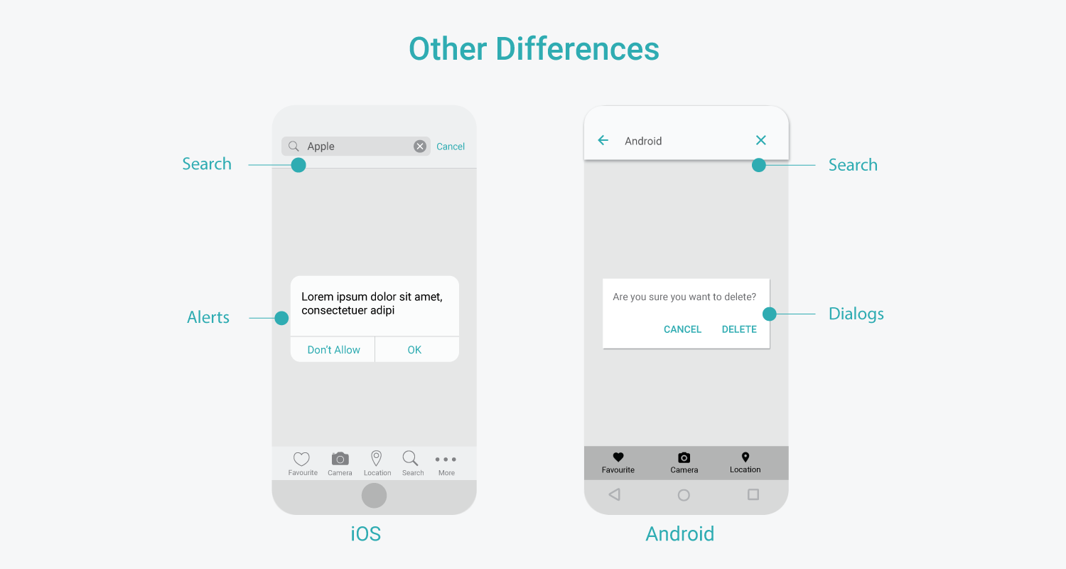
As discussed above, the Search may occupy different positions in the UI, depending on the system. The controls used to operate the Search and the visual style also varies.
When switching between platforms, users might have to pick a few new habits of interactions. Overall though, material design in Android and human interface design in iOS, both maintain familiar patterns for a better experience despite all their differences and unique features.
Both operating systems have identical section divisions. All the navigation and action-based buttons/icons are largely present either on the top or the bottom, and the middle area is devoted to content. This ensures ease of access to the content.
Both the platforms follow necessary conventions like the use of universally understood icons/symbols. This means the magnifying glass icon (search icon) might have different styling on both systems, but the meaning remains the same.

The similarity in touch gestures like tap, scroll, drag, pinch and swipe (with a few exceptions) help users intuitively navigate. Users do not have to relearn these every time. If there are any different interactions, the user is informed about it through labels, colours etc. E.g. The ‘More’ icon on iOS might be new for Android users, but the labelling gives an idea about the meaning.
When brands have their apps on different operating systems, they ensure consistency in branding style, interactions, content, and UX design, so it’s easy for users to switch between both systems. The goal is to deliver as much consistency as possible, while adhering to both human interface design principles and material design guidelines.
These universal patterns help users quickly adjust to any platform they are interacting with.
Apps in this era of phones, laptops, tablets are not restricted to one device. Nor are users.
Therefore, it becomes imperative to adhere to some consistent UI guidelines to ensure a seamless experience and broader adoption by users. The cut-throat competition between iOS and Android has been good for both, making them more polished, more feature-packed and technologically potent. The best design services know how crucial it is to keep these guidelines in mind when designing interfaces on iOS and Android.
1. https://uxdesign.cc/ios-vs-android-design-630340a73ee6
2. https://ivomynttinen.com/blog/ios-design-guidelines
4. https://developer.apple.com/design/human-interface-guidelines/
5. https://learnui.design/blog/ios-vs-android-app-ui-design-complete-guide.html
7. https://learnui.design/blog/ios-design-guidelines-templates.html